X Pro Grid Cells and Responsiveness

Hi there, I’m trying to tie the left and right cells of my ‘This is your Journeyhaven’ grid together so that they scale together.
Right now, at certain in-between break points, one side may be taller than the other:
https://www.labyrinthofenchantment.com/journeyhaven/

Please advise, thanks!

Hi,

Not really.

You can’t with the way you added the image. Instead, use a background image with the blue background on the column. Add a png with the content in the column as an image element like you did. Finally, enable flexbox on the column and center the content of it.

Hi @rotipom,

It seems that you are using a much older version of the theme, please update it to the latest version of Pro i.e 5.0.9. Please find the article on how you can update the theme here: https://theme.co/docs/how-to-update.
The grid cells are in equal height, I would suggest you add the image as background of the left cell to get rid of the height issue you are facing.
If that does not help, please provide login credentials for your site in a secure note to examine it further, including:

– WordPress Site URL & Login URL
– WordPress Admin username/password

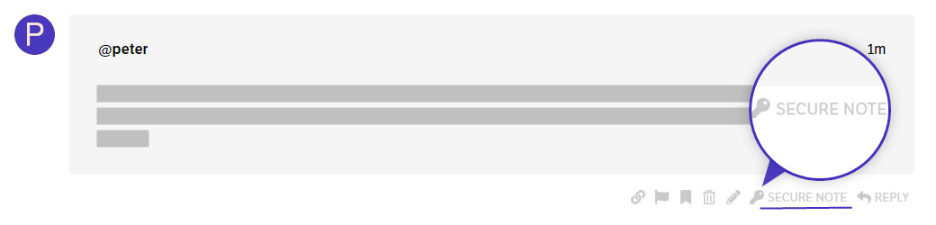
To create a secure note, click the key icon underneath any of your posts.

Thanks

This topic was automatically closed 10 days after the last reply. New replies are no longer allowed.