Hey guys,
Please take a look at the content that i’ve been creating. It doesn’t look good when responsive on a mobile device or ipad.
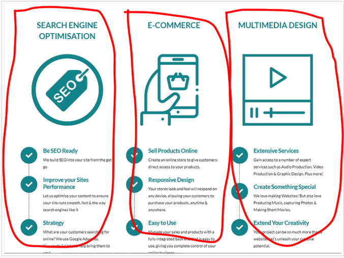
Here is what it looks like on laptop / desktop

Here is what it looks like when responsive:


Thank you.
Hey guys,
Please take a look at the content that i’ve been creating. It doesn’t look good when responsive on a mobile device or ipad.
Here is what it looks like on laptop / desktop
Here is what it looks like when responsive:
Thank you.
Hi There,
Thanks for writing in!
The best way to do this is, put all the three elements in a single column.
That means your section should have three column row and each column have there respective elements inside it.
Hope this helps!
This topic was automatically closed 10 days after the last reply. New replies are no longer allowed.