My website (stob.ca) footers contains a section with four containers in a row. It will wrap (one of Flex features) to two rows or more if I use Firefox and change the browser’s width but it doesn’t wrap when i used safari even on iOS or OSX. Now, i disable three containers when the browser’s width smaller than 767px. I hope it can be fixed on later version.
Hi there,
Thanks for writing in.
The wrap children are working just fine, the same in my installation. Perhaps you’re referring to breakpoints? Like when it’s viewed on a smaller device, the multiple columns will beak into a single column? Unfortunately, it’s not, it’s not the same in content builder’s column since it uses flex styling. What you could do is have 5 containers, 4 containers displayed on the desktop, and 1 container displayed on mobile then that container has all the elements from those 4 containers.
Hence, it will appear as the single column in mobile.
Hope this helps.
i already used 4 containers. For a same page, the left hand side i used safari , it will not correctly wrap all the 4 containers and i can’t scroll left and right to see all the contain. At the right hand side, i used firefox, the wrap children feature is working correctly to wrap the four containers. it is what i mean. 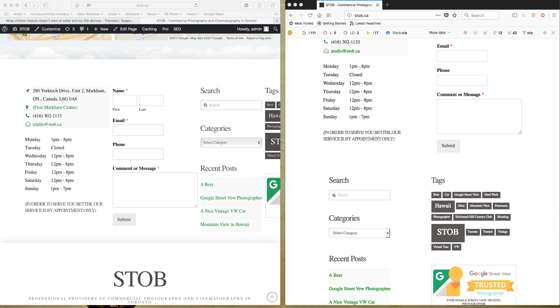
Hello There,
Thanks for sending out the screenshot. This must be a bug in the builder. In the header builder, you can scroll the content. And this option is absent in the footer builder. I’ve submitted this to our issue tracker so the developers will be made aware of it.
Thank you for your understanding.
This topic was automatically closed 10 days after the last reply. New replies are no longer allowed.