Woocoomerce customization

Hello,
i have a few thing i would like to fix in my store.

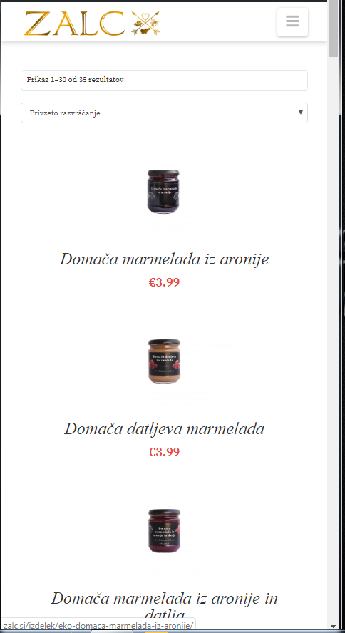
  1. First off lets start with the mobile view of the products when looking in catalogs. The pictures are a good size but the text is way to big and i would like two products in row. This is shown in picture (zalc 7.png)

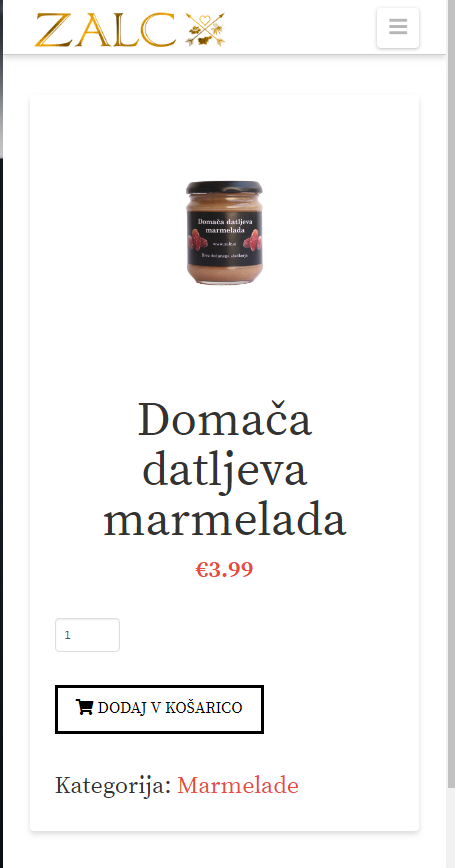
  2. I would also like to make the product title text smaller on product page, this should be an easy one i just cant find it (zalc 6.png)

  3. I have a problem with the cart page. When the screen is small the products image completly dissapers and everything else is the same big size. I would like the text and buttons to be relative to the size of the screen and also so i can see the picture. Picture(zalc 8.png)

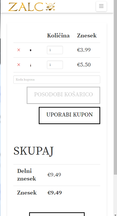
On the same note i would like that when in desktop mode when there is enogh space that the product description and quantity would be on one side and the price combined on the right side(now it is under the products). Picture (zalc 1.png and zalc 2. png)

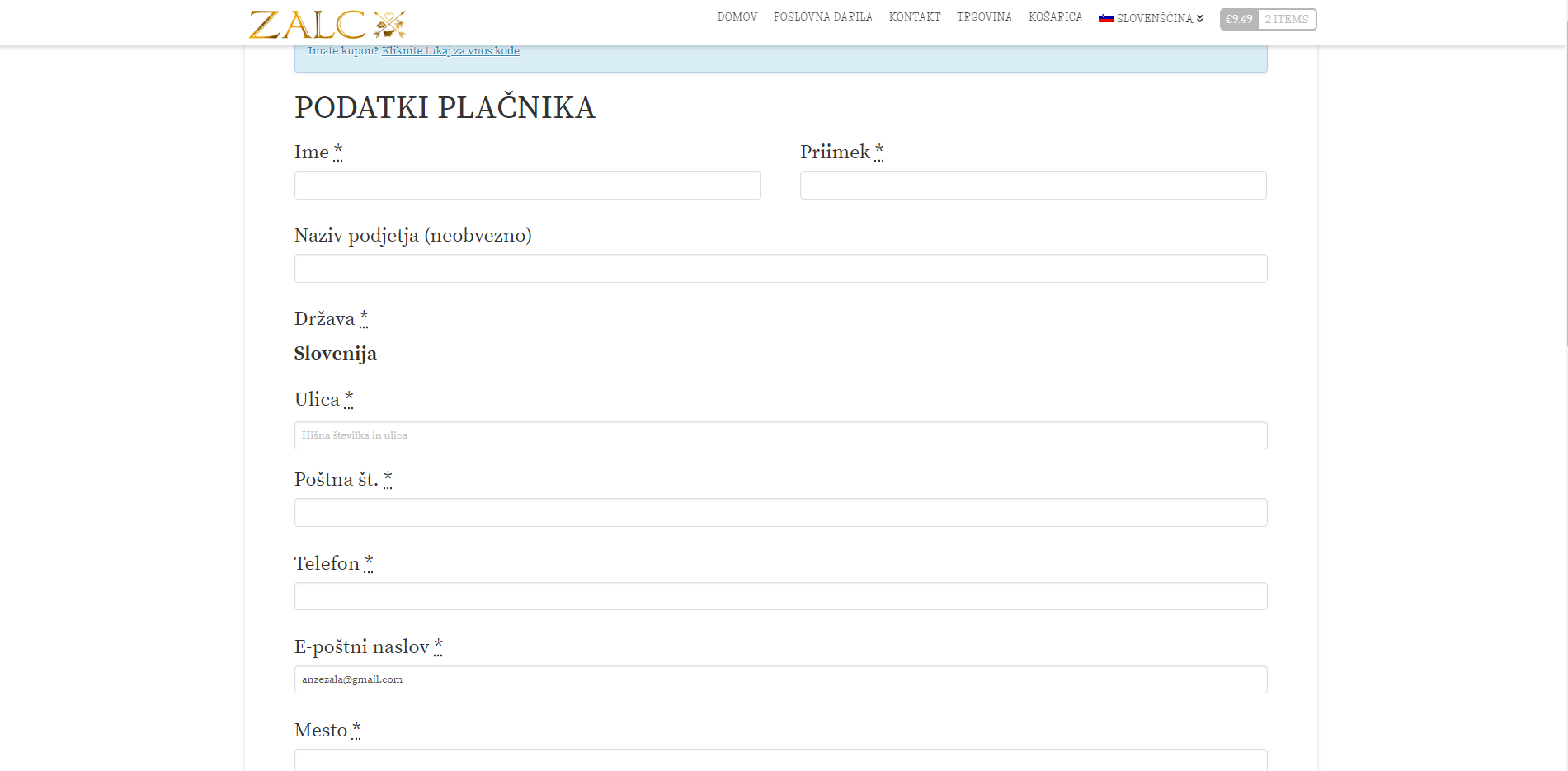
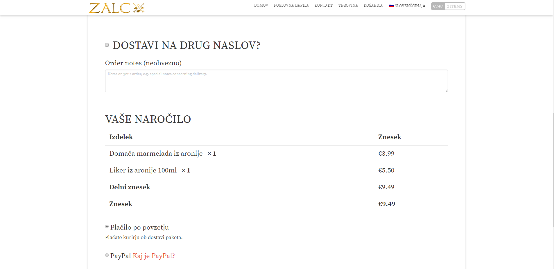
  1. I have the same issue on the chechout page. The buttons and everything is way to big. I would like to be relative to the size and i would also like to have the invoice made on ther ight side of the screen and the shipping and billing information on the left side. Pictures (zalc 3.ong and zalc 4.png)

My website is: www.zalc.si

Thank you.

Hi @anzezala,

Thanks for writing in!

1.) If you want to have a smaller text and two columns of product items, please add the following CSS code in the X > Theme Options > Global CSS (http://prntscr.com/evui3r)

@media(max-width: 480px){
    .woocommerce li.product .entry-header h3, 
    .woocommerce-page li.product .entry-header h3 {
        font-size: 16px;
    }

    .woocommerce .cols-3 li.product {
        width: 48%;
    }
}

2.) To have a smaller font size for the single product title, update the code in #1 and you can make use of this code:

@media(max-width: 480px){
    .woocommerce li.product .entry-header h3, 
    .woocommerce-page li.product .entry-header h3 {
        font-size: 16px;
    }

    .woocommerce .cols-3 li.product {
        width: 48%;
    }
  
    .woocommerce div.product .summary .product_title {
      font-size: 26px;
    }
}

Since most of the text is relatively small or bigger, please check out this threads:
https://theme.co/apex/forum/t/general-guidance-on-font-sizes/27055/2, https://theme.co/apex/forum/t/stepped-vs-scaling-root-font-size/19281/2

Hope this helps. Please let us know how it goes.

Hi,
thank for the response but it actually didn’t change much. The only thing that wa made is that the text in the product page and the collections page is smaller which is great but all the other questions are not aswered.

Could you please help me also with my question 3 and 4 and i still dont know why there aren’t two products in a row on mobile.

Thanks

Hello @anzezala,

Thanks for updating the thread. :slight_smile:

  1. I checked the cart page and can see images are getting displayed but the width is such that it’s difficult to see. I suggest you to try regenerating the images using plugin like:


2. Please add following CSS under X > Theme Options > CSS:

@media only screen and (max-width: 600px) {
    .woocommerce .cart .actions>input, .woocommerce .cart .actions>button, .woocommerce .button {
    padding: 0.3em 0.5em 0.3em;
    font-size: 0.5em;
}
}

1- I have found the proper CSS code selector using the Chrome browser Developer Toolbar: https://www.youtube.com/watch?v=wcFnnxfA70g

2- For the CSS code itself, I suggest that you get started with this tutorial: https://www.youtube.com/watch?v=yfoY53QXEnI

Thanks.

Thanks for the reply, but it wasn’t really helpful.
I had four problems and we managed to fix half of one. I get that it would be great to know the CSS for everything myself and do this but i am not a developer. I would hope that support could help me out a little bit here.

Hello @anzezala,

To better assist you, I would recommend that we resolve one issue at a time to avoid getting the responses mixed up and avoid any complicated replies.

Please respond to us which one is resolved and which one is still an on going issue. And then we resolve any of the issues one after the other by posting it in your next reply and start from there.

Please bear with. Thank you for your understanding.

Hello,
ok. Then lets start with the cart page. I would like the text in the card page to be responsive. Right now when you look at the cart from any device that isnt a desktop computer the propotions are off. The picture of the product keeps getting smaller while the products name, price, quantity are the same size.

The same problem goes on the lower part of the cart page with the price breakdown which is the same size all the time.

The main thing would also be that the breakdown would be on the riht side on desktop and below on mobile, becasue the fields are way to big on desktop.

Thanks.

Hi @anzezala

To reduce the font size in mobile and make your cart in two columns, you can add the code below in Theme Options > CSS

@media(min-width:979px) {
  form.woocommerce-cart-form {
     float: left;
    width: 60%;
   }

.cart-collaterals {
       float: right;
    width: 35%;
}
}

@media(max-width:767px) {
.woocommerce .cart-collaterals .cart_totals h2 {
    font-size:100%;
}
.woocommerce .cart-collaterals table {
    font-size: 16px;
}
.woocommerce .cart .actions>input, .woocommerce .cart .actions>button,
.woocommerce-cart-form .checkout-button.button {
    font-size: 14px;
}

 .woocommerce-cart form.woocommerce-cart-form * {
    font-size: 20px;
}
}

You may change the font size and width to adjust according to your preference

Thanks

Thanks worked great.

There is only one thing. The collaterals dont align with the cart. It is like it has a little bit off padding on desktop.
If we could fix that please.

Also i would like that the product name is displayed. It doesnt show when the screen is smaller.

The other thing is i would like the same same thing on the checkout page. So that the collaterals are on the right and font size is smaller.

Thank you

Hi There,

Please also add this custom CSS:

@media (max-width: 767px){
    .woocommerce .cart.shop_table .product-name {
        display: table-cell;
    }
}

Could you please provide us with a screenshot?

Many thanks.

Helo,
Here is the srceenshot

Hi There,

Please also add this custom CSS:

.woocommerce .cart-collaterals .cart_totals {
    margin-top: 0;
}

The result:

Hope it helps :slight_smile:

This topic was automatically closed 10 days after the last reply. New replies are no longer allowed.