Hello
On http://dev.orijinmedia.com/limay, I’m doing the mobile optimization and on some resolutions, there is a line at the right of the entire website like you can see in the print screen http://prntscr.com/fy3eqw.
I checked it out on my galaxy s5 and there I could see it too.
Could you take a look at it?
Thanks
Hi There,
Unfortunately, your site is not loading at the moment. Please check in with your hosting provider.
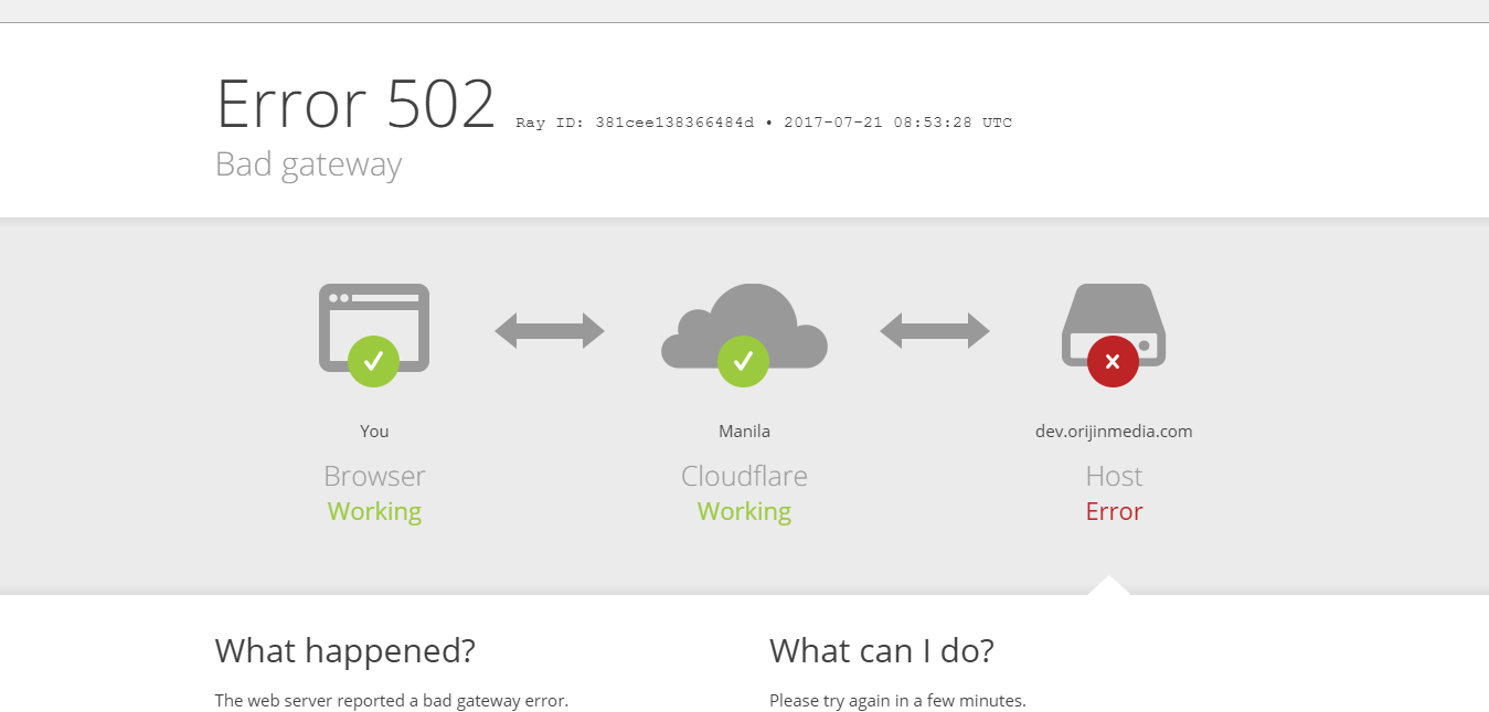
Hello
I resolved that issue, there was a text which was “out of limits” 
There is another issue in what you might be able to help me
http://prntscr.com/fzlmlz
Here is a print screen of the issue, the underline of the nav items is not underline, it is above, and I can’t bring it below the nav item.
I found out that this might work in css, it worked in the chrome editor
“header .x-navbar .desktop .x-nav > li > a
{
height:-1px !important;
}”
but when I insert it into the CSS nothing happens.
Thanks
And there is another issue, on some elements, for ex : “Rates & Availability
Or call our U.S. office in Jackson Hole, Wyoming.
307-739-8093”, the bottom pink element, when you hover over the white button, sometimes it jitters, and I saw this on other elements too, do you have any idea why is that?
thanks
Hi,
Please change this code
.piroska {
    box-shadow: 0 2px 0 0 hsl(343,87%,57%);
}
with this
.piroska > a > span {
    border-bottom: 2px solid hsl(343,87%,57%);
}
With regards to your another issue, I can’t seem to replicate it on my end.
Can you provide us a video.
Thanks