https://baggator.org/
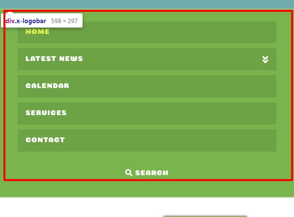
I’ve used this code to force the menu to stay open on smaller screen sizes but I’m getting a double menu - the burger and the open, please can you help.

@media (max-width: 800px) {
body .x-navbar .x-btn-navbar {
display: table;
margin: 0 auto;
}
body .x-navbar .x-nav-wrap.desktop {
     display: none !important;
}

body .x-navbar .x-nav-wrap.mobile {
     display: block !important;
}
}
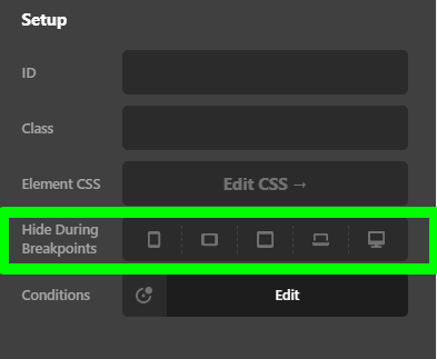
Also on the front page, built in Cornerstone there is an entire row missing when I look at the site on a smaller screen. I can’t see anywhere where I have hidden it for particular screen sizes. Any insight would be appreciated! Thank you