Website looking fine in cornerstone but not functioning properly on mobile.
The product and contact page are not working properly on a mobile device.
Could use some advice.
Thanks
Website looking fine in cornerstone but not functioning properly on mobile.
The product and contact page are not working properly on a mobile device.
Could use some advice.
Thanks
I thought it might be a HIDE BASED ON SCREEN
issue but after playing around with those options, it’s just not working correctly.
Hi Ted,
I have tried inspecting the site through the console and the elements that go missing on mobile have the classes that hide elements on small and extra small devices.
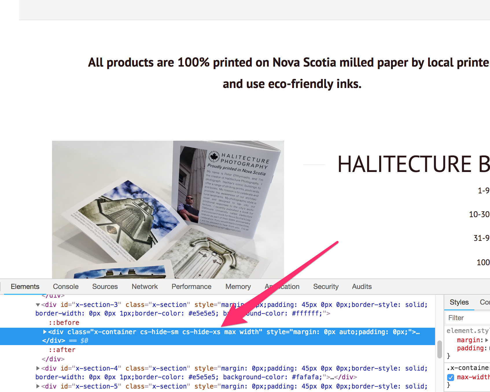
This indicates that the Hide Based On Screen option was used to hide the elements through the row container.
If you have checked the option on the section’s settings, kindly also make sure you check the Hide Based On Screen option of the row that contains the elements.
You can find the Hide Based On Screen option in the actual element setting, row, and section settings.
Please check the screencast below for a guide:
Hope this helps.
Genius! Got it fix, thanks!!!
Glad to hear it’s sorted. 
This topic was automatically closed 10 days after the last reply. New replies are no longer allowed.