Vertically line up elements on mobile screen

Site: www.5x5advisory.com

How do I get the four elements in this column - image, headline, image, button - to be displayed vertically once the screen size is reduced to mobile viewing? And how do I make sure some margin exists between the columns when displayed vertically on mobile? (At full size, there is.)
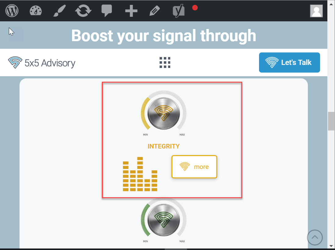
Thank you!
Hi lancesalyers,

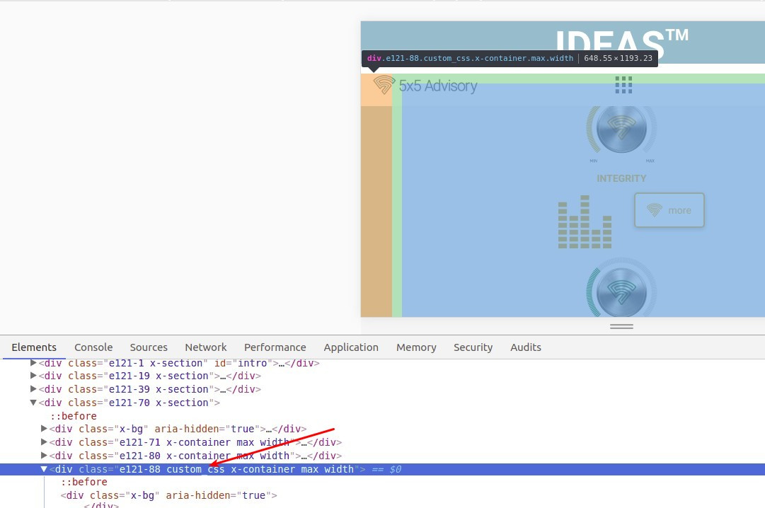
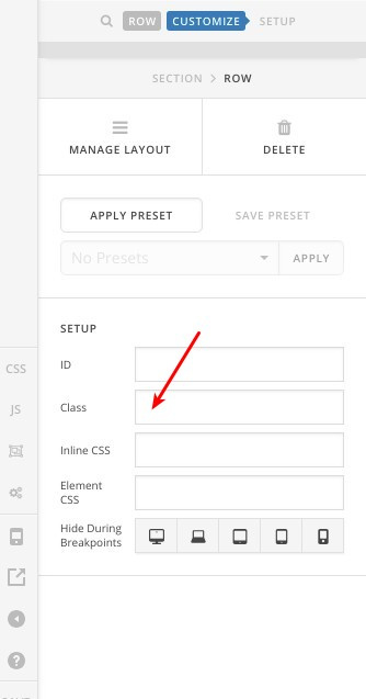
You can do that by adding a custom CSS class to this specific row, check this screenshot:

Let’s say custom_css for example:

Then you will have to add this CSS code to (X > Theme Options > CSS):

@media screen and (max-width: 768px){
    .custom_css .x-column a, .custom_css .x-column span, .custom_css .x-column div,  .custom_css .x-column img {
        display: block;
        text-align: center;
        margin: 20px auto;
    }
    .custom_css .x-column .x-anchor-button {
        width: 20%;
    }
    .custom_css .x-column .x-anchor-button span, .custom_css .x-column .x-anchor-button img {
        margin: 0 auto!important;
        display: inline-block;
    }
}

Thanks.

Worked like a charm. Thanks so much, Alaa!

You are most welcome. :slight_smile:

This topic was automatically closed 10 days after the last reply. New replies are no longer allowed.