UberMenu Mobile Issues

Hello,

We’re using UberMenu and are having a few issues with it that we have not encountered in the past.

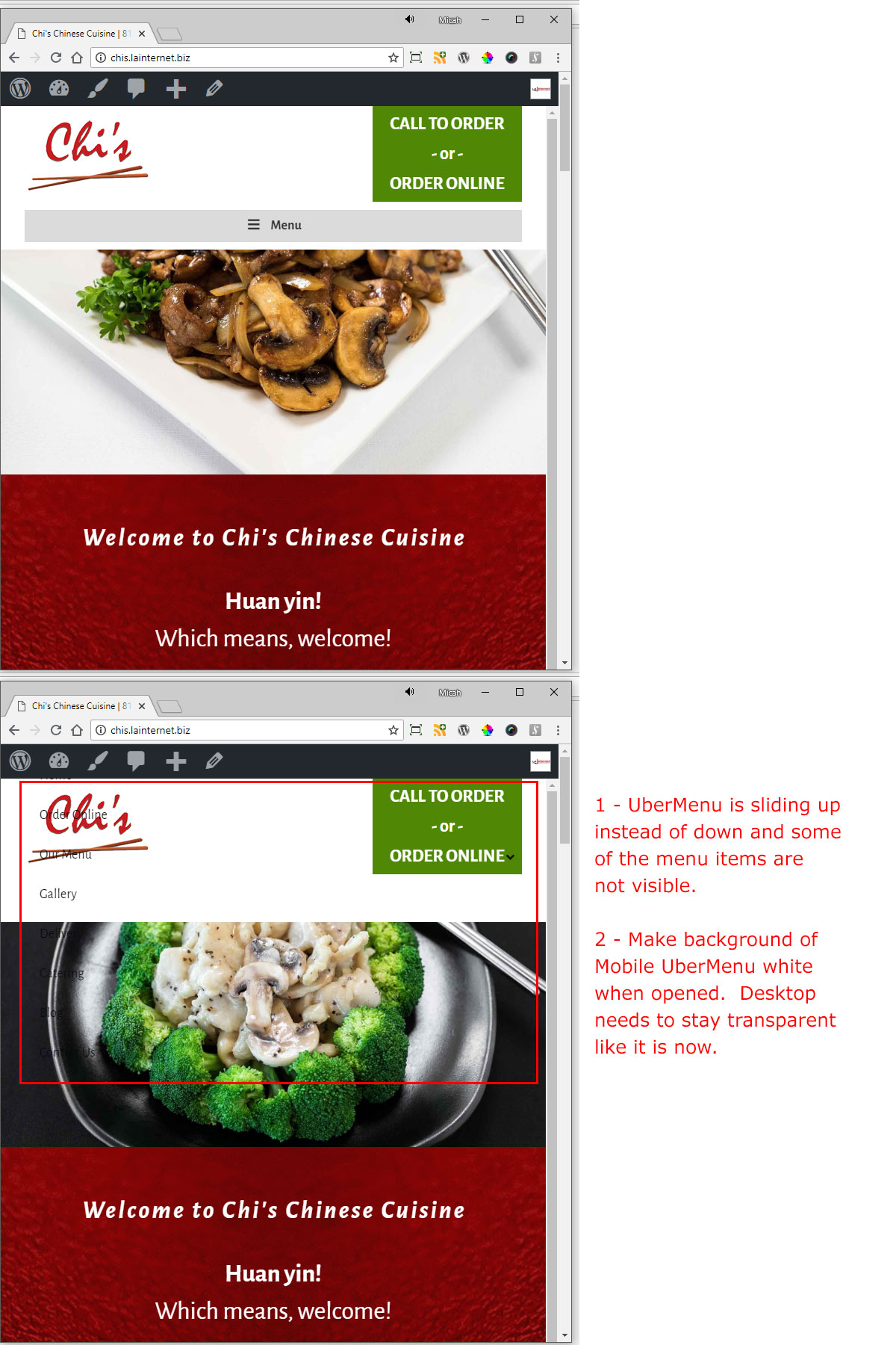
1 - On Mobile View, UberMenu is scrolling up instead of down. This is making menu items not visible as they are cut off at the top of the page. How can we make it scroll down instead of up?

2 - On Mobile View, we want the menu to have a White Background when opened. On Desktop View, we want things to stay how they are currently configured.
Thanks for the help.

Micah
Hi Micah,

I need to check your Header settings and Ubermenu Settings.

Would you mind providing your login credentials in Secure Note.

Thanks

Hi Micah,

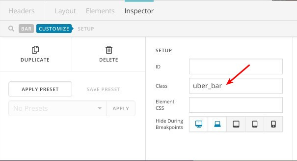
You can edit the “Mobile Menu Header Bar” and add a custom CSS class to it like this one:

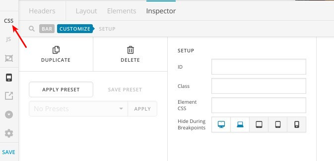
Then you can add this custom CSS code to (Header > CSS) as in this screenshot:

@media screen and (max-width: 980px){
    .uber_bar .x-bar-container {
        display: block;
        margin-top: 20px;
    }
    .uber_bar nav.ubermenu-main {
        background: #fff;
    }

As this is all custom development, regretfully we wont be able to assist further. Custom development is outside the scope of our support. Were happy to provide advice and get you started in the right direction, but you would still be responsible for the implementation. And moreover, this solution may not work after several updates especially if the themes structure changed or overridden.

Thanks.

Thanks for the help.

That resolved the primary issue. I can style it from here.

Micah

You are most welcome. :slight_smile:

This topic was automatically closed 10 days after the last reply. New replies are no longer allowed.