Type text on mobile view

Hi,

I am having some issues related to type text. There is a heading with type text on my home page. It looks fine on desktop but on mobile it breaks to 2 lines and because of that animation whole viewport keep shifting up and down. This is very bad for usability issue on mobile. Can you suggest me a solution for this?

You can see the attached screenshot.

Amit
Hi Amit,

We need to add break after the text Creative on mobile view.
1.) Duplicate current headline.
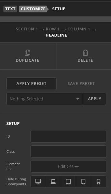
2.) Inspect each headline element. Go to Customize tab >HIDE DURING BREAKPOINTS. Set the first header to be visible on desktop. Set the second header to be visible on mobile.

3.) Edit the content of this second header and add a break like this after creative:
Creative <br>
The break tag will make sure the typing text will start on a new line.

Hope this helps.

Thanks. Now <br> is showing as content visually :roll_eyes:

Hey Amit,

Instead of <br> tag, please add the following code in the Theme Options > CSS:

@media screen and (max-width: 767px) {
    .x-text-typing {
        display: block;
        min-height: 61px;
    }
}

Here are some related links for further reading, this could help you in finding and implementing some CSS fixes:

Don’t forget to clear all caches including your browser’s cache after adding the code. Let us know how this goes!

Thanks. It worked fine.

You’re welcome!

This topic was automatically closed 10 days after the last reply. New replies are no longer allowed.