Two columns in a row on a mobile device?

Hi, I have a site which uses 2 columns to display “Pros & Cons” of a product and I would like them to display side by side on a mobile device (if the text is short enough) rather than one on top of the other.

The only slight complication is that these 2 columns themselves are inside a column.

Here is a page example: https://geardude.info/best-electric-guitar-strings-2020/

Thanks!
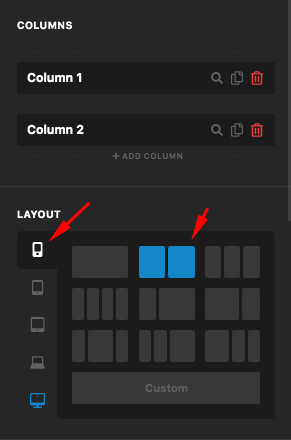
Hello Gabriel,

Thanks for writing in! Since you have nested the column, it is still very easy to have two columns in a smaller screen. Please set the two-column layout for smaller screens in your row container settings.
qGrlDAaGRRyhwUI6OfYrhA

Which row element as you may ask? Take this element structure as an example:

  • section
    • 1st level row container
      • 2/3 column

        • 2nd level row container
          – 1/2 column
          – 1/2 column
      • 1/3 column

The row settings that I was referring to will be in the 2nd level row container settings. To learn more about the row element and the layout settings, please check this out:

Or you can check out this video tutorial:

Hope this make sense.

1 Like

Perfect, thank you. I was reading 5 year old posts about using CSS and there is now a simple built-in solution!

Glad that we could be of help :slight_smile:

This topic was automatically closed 10 days after the last reply. New replies are no longer allowed.