Trying to understand Classic Revolution Slider for Desktop / Mobile

Hi,

I recently took over this site from another developer and I’m unsure of how the developer set the slider to display on desktop but an image to display on tablet and mobile devices.

When I edit the home page, I can see both the Classic Revolution slider block and the Image block below it (screenshot attached).

When I go to Settings, neither option for above/below header for the slider is active. They are both deactivated.

When I go into Revolution Slider itself, I have it set to only Desktop and Laptop. I did have it set to tablet and mobile too, but it doesn’t display, so I turned them off for now.

I’m unsure as to why I see the Classic Revolution Slider in the Edit video of the screen and then the Image blow below itm, but the Slider doesn’t display. The image block is filling the Layout for tablet and mobile devices in the column, which is fine for mobile and tablet, but I’m just not clear on how get the slider to work on mobile.
Hi Tina,

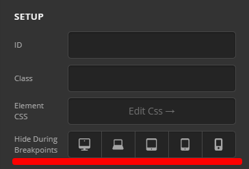
You have check all possible settings except HIDE DURING BREAKPOINTS.

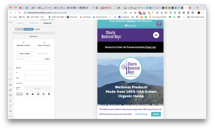
Please inspect section or row. Go to Customize tab and you can see that option. Most probably, that was the settings use to display Revslider on desktop and Image on mobile. There might be 2 sections or 2 rows. The first one is hidden on mobile and the other is hidden on desktop.

If you can’t see it still, please share the URL so we can check. Thank you.

Okay, the URL is https://clearlybalanceddays.com.

When I look in the Customize tabs for the section or the row, none of the devices are hidden.

Cloudup

I do see where the Image itself is hidden for desktop, laptop, but not the Rev Slider.

Hi Tina,

The slider is not applied as masthead slider (above or below masthead), it’s added as revolution slider element. The hide during breakpoints is not applied to the rev slider element, instead it’s hidden through the slider settings itself. Which is why if you go to device preview in the builder, the area where slider is added remains empty.

As you said, you set it to display on desktop and laptop, but you turned off the tablet and mobile. Hence, it’s not displayed on smaller devices. I can see that through the codes, if you plan displaying the slider on all devices then please remove those restrictions. It’s not builder related.

Thanks!

Okay, I’ll check into that and see what happens when I change it in the Revolution Slider settings, itself.

Thanks for trying the suggestion, Tina.

This topic was automatically closed 10 days after the last reply. New replies are no longer allowed.