Trying to prevent elements being stacked ontop of each other when browsing on mobile

Hey friends,
My website is dkstudios.com.au

I would like to prevent stacking of the images in the ‘our clients’ section of the site on mobile because it makes them way bigger than they need to be and causes the user to need to scroll forever to get past that section.

How can I accomplish this?

Thanks,
David
Hi There,

Thanks for writing in!

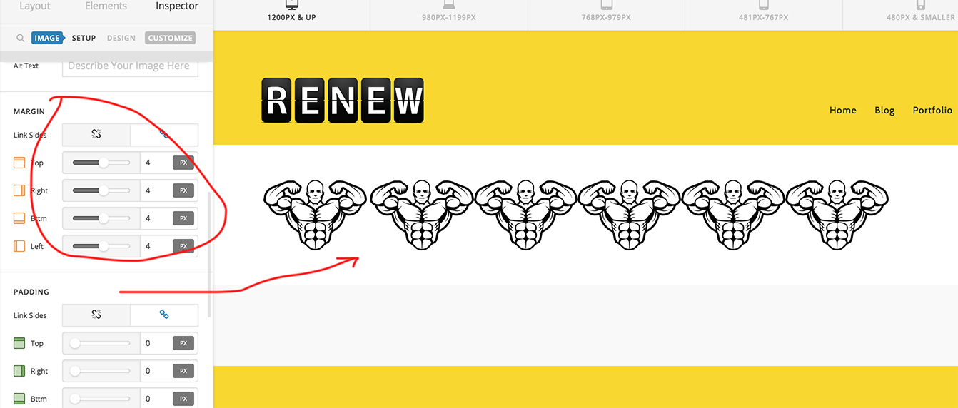
The best way to achieve this, please put all the images in the row to a single column and manage gap giving margin to the image itself.

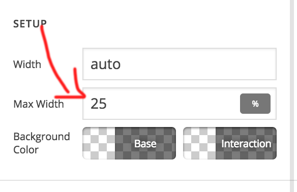
As you have 5 images in a row please give max width as 25% to each image.

So that they won’t be stacking in mobile view.

Another way is to make all the 5 image to a single image.

Hope this helps!

1 Like

Thanks mate! seems to have almost worked…

Only problem now is, it looks good in the editor, but when viewing the site outside of cornerstone, it doesn’t fit all 5 images on the same line…

Do you know what I might be doing wrong?

Hi There,

Thanks for writing in!
As you have setup padding 5px, you need to decrease the width of the image.
Please make it 19% instead of 20%.

Hope this helps!

This topic was automatically closed 10 days after the last reply. New replies are no longer allowed.