Transparent menu with slider

Old site- www.amsterdamavenue.com
new site using theme X- http://mezzalunabrewster3.cuisinehunter.com/

I am trying to rebuild this site using theme X but having some trouble…I want to do a transparent menu and have pictures from the slider under it. I also want to be able to change the font on the menu. How would i do that?

The menu you see on the site now is all done on the slider. It is not responsive.

Please let me know
Thanks
Bruce
Hi Bruce,

Remove the menu out of revslider. Create the menu on Appearance > Menu and then set is a primary menu.
On your home page, under Page Settings > Slider Settings: Below Masthead: Choose this slider
Then on Theme Options > Global CSS: Add the following:

.home .masthead {
    position: absolute;
    width: 100%;
}

This is a demo with the same setup: http://demo.theme.co/app/

Hoep this helps.

Hi…

I just converted my license to pro…would this be done the same way with the pro theme?

Hi There,

If you keep using the legacy/classic header, yes.

If you decide to use Pro Header Builder, you have the toggle to set your BAR to absolute position.

Hope it helps

Thanks Joao…I as able to make the header transparent…http://mezzalunabrewster3.cuisinehunter.com/

I have some more issues like changing the font and changing the color and font of the menu on the main page. Should I post this in a separate post?

Also I noticed that the name of the site is not responsive when using a mobile… I inserted text for the name on the new site…should I have done it another way? and the menu button looks weird on mobile

Old site- www.amsterdamavenue.com2
new site using theme X- http://mezzalunabrewster3.cuisinehunter.com/2

I created a new post with the issues i have been having…https://theme.co/apex/forum/t/trying-to-duplicate-an-existing-site-with-x-pro/16989

Hi again,

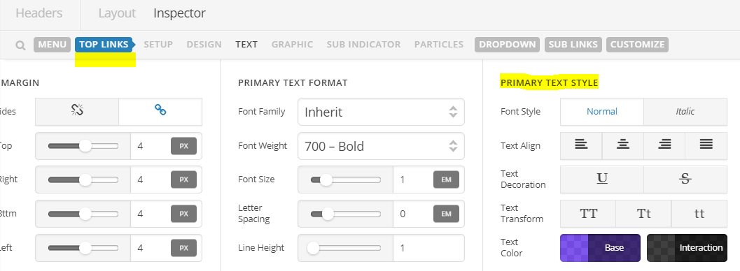
You can change the font color and font menu in Header Builder (see screenshot)

To make the site title responsive, make use of the following code:

@media screen and (max-width: 979px) {
  .hm3.x-text {
    font-size: 1em;
    font-size: 3vw;
  }
}

I checked your site in mobile mode and the menu button looks fine on my end, would you mind clarifying a bit so we can take a closer look?

Thanks!

This topic was automatically closed 10 days after the last reply. New replies are no longer allowed.