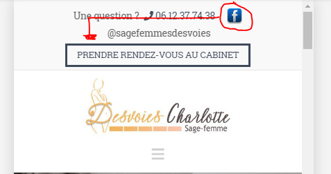
Topbar for mobile

Hello,

I am using a topbar for my website, with the following code, which looks good on desktop but not on mobile:

< div style="float:left; padding-top:13px; font-size:15px;">< span style="color:#636363">Une question ? &nbsp;</span><i class="x-icon x-icon-phone" data-x-icon="" aria-hidden="true" style="color:#434f60"></i> < a href="tel:+33%206%2012%2037%2074%2038" style="color:#434f60">06.12.37.74.38</a> &nbsp; &nbsp; < a href="https://www.facebook.com/sage-femme-desvoies/" alt="Page Facebook Sage Femme" target="_blank">< img src="https://charlotte-desvoies.fr/wp-content/uploads/2018/09/test4-fb.jpg" alt="logo Facebook" width="25px" ><span style="color:#636363">&nbsp;@sagefemmesdesvoies</span></a></div>
<div style="float:right">< button class="timify-button x-btn blue2-btn x-btn-small x-btn-global" data-id="5b8a7e519902fc501864e9fb" style="padding-bottom: 0.563em; margin:5px 0 4px 0;">Prendre rendez-vous au cabinet</button></div>

It looks like this on mobile
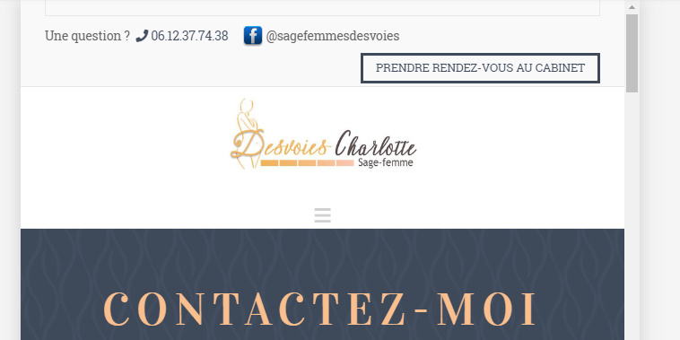
How can I change the code so that:

  1. All the elements of the topbar are centered on mobile
  2. Remove the strange things at the very top of the topbar (no idea where it comes from as I can not see it on desktop)
  3. The logo in the header is centered vertically (removing the spacing bellow it)

Thanks,
Antoine
Hi There,

Please add this custom CSS under Theme Options > CSS:

@media (max-width: 767px){
    .p-info {
        display: none;
    }
    .x-topbar-inner > div {
        width: 100%;
    }
}

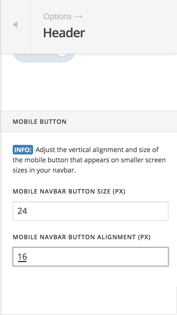
Please navigate to Theme Options > Header > MOBILE BUTTON > MOBILE NAVBAR BUTTON ALIGNMENT (PX) then change the value to 16 instead of 36:

Hope it helps :slight_smile:

Thank you, it helps a lot :slight_smile:

One last thing, I do not manage to get the Facebook icon to stick with the text behind it, despite the nbsp; thant I used. What should I change to make it work?

Here is my code:
<div style="float:left; padding-top:13px; font-size:15px;"><span style="color:#636363">Une question ? &nbsp;</span><i class="x-icon x-icon-phone" data-x-icon="" aria-hidden="true" style="color:#434f60"></i> <a href="tel:+33%206%2012%2037%2074%2038" style="color:#434f60">06.12.37.74.38</a> &nbsp; &nbsp; <a href="https://www.facebook.com/sage-femme-desvoies/" alt="Page Facebook Sage Femme" target="_blank"><img src="https://charlotte-desvoies.fr/wp-content/uploads/2018/09/test4-fb.jpg" alt="logo Facebook" width="25px"><span style="color:#636363">&nbsp;@sagefemmesdesvoies</span></a></div>

Hi @Lecoqdigital,

It’s not going to work since the element is an inline element. You can change it to this

<div style="float:left; padding-top:13px; font-size:15px;"><span style="color:#636363">Une question ? &nbsp;</span><i class="x-icon x-icon-phone" data-x-icon="" aria-hidden="true" style="color:#434f60"></i> <a href="tel:+33%206%2012%2037%2074%2038" style="color:#434f60">06.12.37.74.38</a> &nbsp; &nbsp; <a href="https://www.facebook.com/sage-femme-desvoies/" alt="Page Facebook Sage Femme" target="_blank" class="top_bar_fb"><img src="https://charlotte-desvoies.fr/wp-content/uploads/2018/09/test4-fb.jpg" alt="logo Facebook" width="25px"><span style="color:#636363">&nbsp;@sagefemmesdesvoies</span></a></div>

Then add this CSS too

@media ( max-width: 767px ) {
.top_bar_fb {
display: block !important; /* instead of inline */
}
}

Thanks!

Thank you!

You’re most welcome!

This topic was automatically closed 10 days after the last reply. New replies are no longer allowed.