Hey Susan,
Upon checking, the code suggested by Friech was not applied.

Before I go to custom coding and hacking the Topbar, I’d like you first to understand the points I’ll list below.
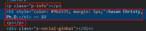
- The Topbar Content is only for simple text. As you can see right now, your current HTML output of the Topbar is not valid though it looks ok in the browser. What you’re technically doing is hacking the output, which is not recommended. You should not place any block-level elements like headings and divs inside a p tag.

Because it’s not valid, the browser attempts to correct it but yet it outputs unnecessary empty p tags.
- Custom coding is outside the scope of our support. We can help you if you get stuck using our products, but we will do not cover coding custom designs. We are also not responsible for the custom codes we show here in this forum as they are only meant to provide guidance. They are not part of our products.
The correct solution for this case is to upgrade to Pro theme, which has a Header Builder so you can create custom header designs that are not possible with X, including your design.
Because the points weren’t made clear, I’ll provide a custom code for now but you should be reponsible for the continued development of your design. Otherwise, you should hire a web developer to continue custom coding for you.
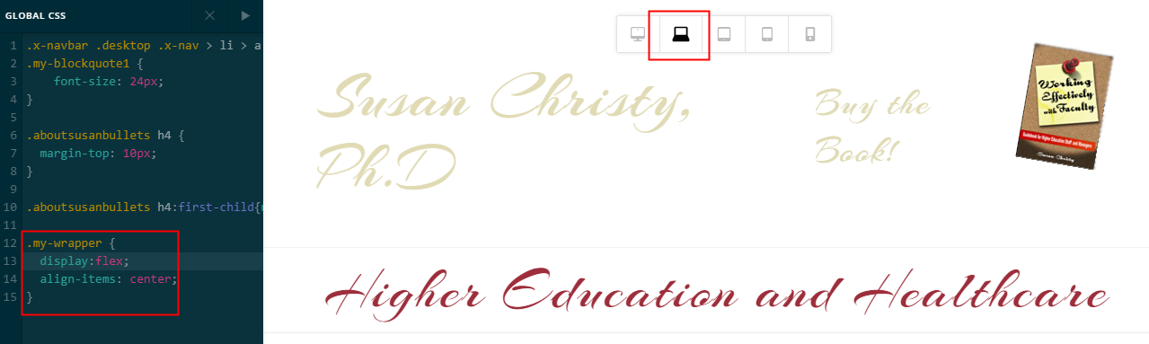
Please paste back the HTML Friech suggested but this time, instead of using the previous CSS, please use this:
.my-wrapper {
  display:flex;
  align-items: center;
}
On desktop, the result of the CSS would be this:
On mobile, it would be this:
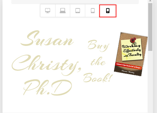
Those screenshots were taken only in preview. I didn’t save them in order not to break your progress.
If none of that is what you were after, please consult with a third-party developer.
It’s best that you upgrade to Pro though as one of the reasons it was built is to allow users to create custom header designs especially the ones that are not possible with X (at-least without custom coding). On top of that, the code output is clean and valid as compared to hacking the Topbar.
Hope that helps and thank you for understanding.


