Hi, I have discovered that my top bar does not function correctly on tablets. I have phone numbers etc but the font are overlapping.
URL https://www.steedman.co.uk
I have a screen shot but not sure where to attach it.
Many thanks, R
Hi, I have discovered that my top bar does not function correctly on tablets. I have phone numbers etc but the font are overlapping.
URL https://www.steedman.co.uk
I have a screen shot but not sure where to attach it.
Many thanks, R
Hi there,
Thanks for writing around! I see you’re hiding your topbar in smaller screens, I tried the landscape view of a tablet and your topbar looks normal, however you can try adding the following code in the Theme Options > CSS:
@media screen and (max-width: 979px) {
    .x-topbar .x-topbar-inner {
        width: 97%;
    }
    .x-topbar .p-info span, .x-topbar .p-info a {
        font-size: 12px !important;
    }
    .x-topbar .x-social-global {
        display: flex;
    }
}
@media screen and (max-width: 767px) {
    .x-topbar .p-info {
        padding: 0.8em 0 !important;
        background-color: transparent !important;
    }
}
Hope this helps!
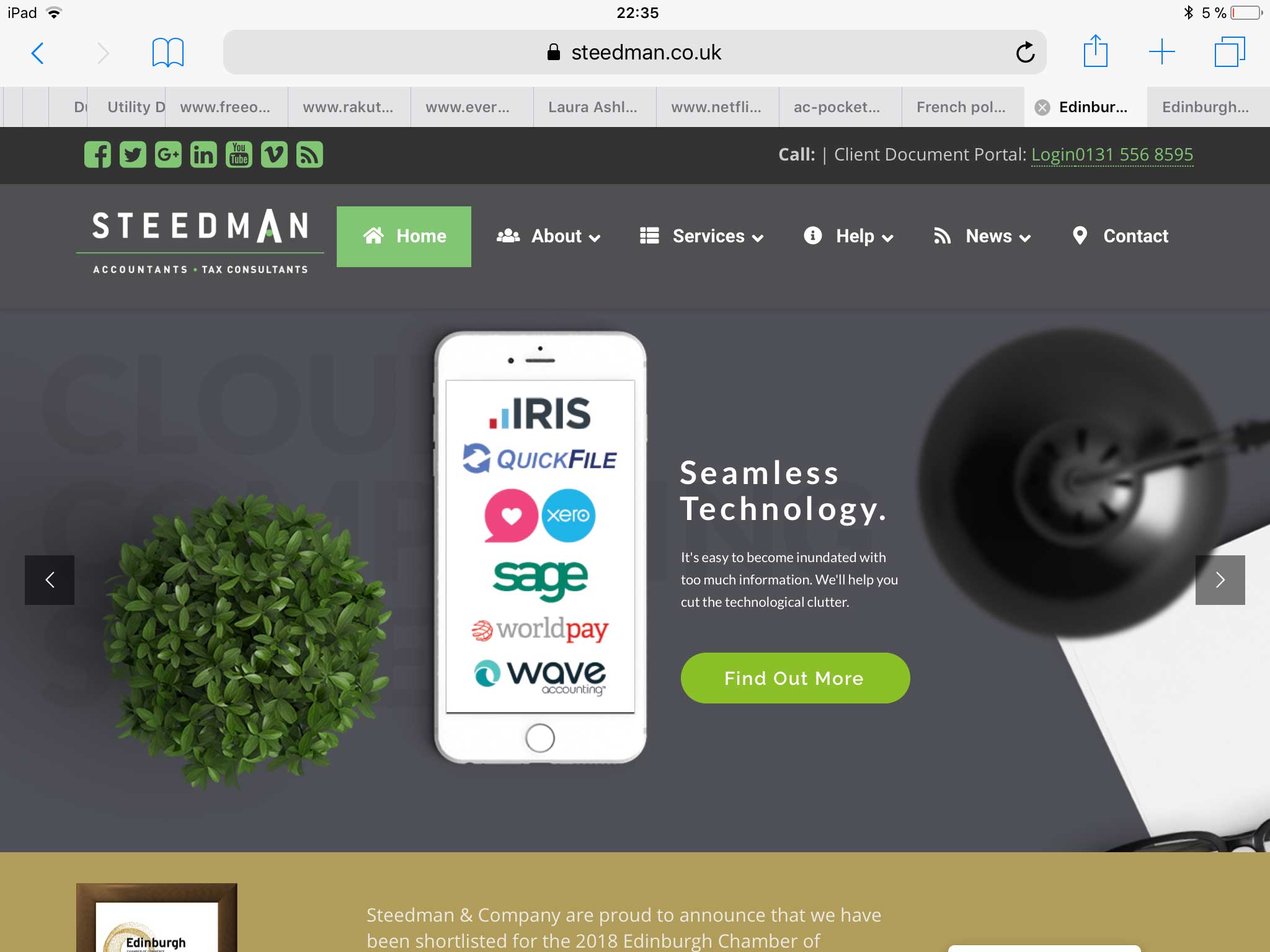
Hi, I tried to implement that code but it didn’t work. The tablet I am previewing on is an iPad mini. So, it may look fine on a normal although, ideally I’d prefer for it to work on every possible device.
I managed to upload a screen grab of how it looks in landscape on the iPad mini so you should be able to get a better idea of what i mean. Basically the text is overlapping. I do already have quite a bit of Additional CSS to control the appearance of the top bar so that could be affecting it.
Any help much appreciated, thanks again!
Hey @russell3,
I don’t see an issue on my end. The text is different.
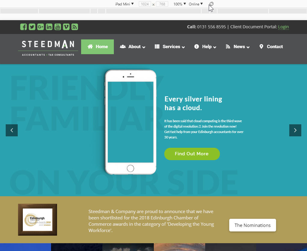
Please tell us how we can get to your view.
Thanks.
Hi, oh the view from the screen shot is when looking at the site in landscape mode on an iPad mini. It seems to be OK in other scenarios. It is probably a problem with the short codes or something.
Hi Russell,
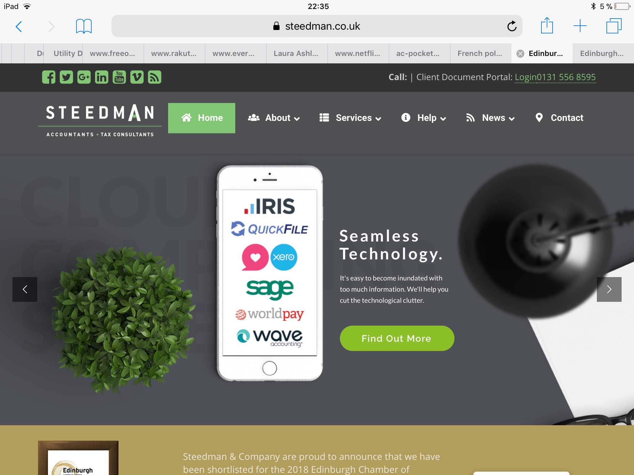
The screenshot provided by Christian is actually in landscape mode. Please provide a screenshot that shows the text overlapping issue so we can do further investigation. And please clarify, did you intentionally hide the topbar on screenwidth 979px and below? (That included the iPad mini portrait)
In the meantime, please clear and deactivate your caching and minifying plugins for a while.
Thanks,
Hi, I have attached screen shot. Many thanks
Hi There,
Pleas find this custom CSS:
.x-topbar p.p-info a {
    float: right;
    color: #81C673;
}
And change to this:
.x-topbar p.p-info a {
    color: #81C673;
}
Hope it helps 
This topic was automatically closed 10 days after the last reply. New replies are no longer allowed.