https://millersseptic.com/
Is there css that will make the top bar look better on mobile view. The coupons could be first then the menu?
Hello @proximomktg,
Thanks for asking. 
I see that the coupons are showing up first and then menu. Please see screenshot. https://cl.ly/1U242S2u1C3I
However, you can add few CSS to improve the visual presence of the elements. Please add following CSS under X > Theme Options > CSS:
@media only screen and (max-width: 600px) {
    .x-topbar {
    margin-top: 10px;
}

.x-social-global.topbar-menu {
    margin-top: 14px;
    font-size: 14px;
}

.x-topbar div.x-social-global {
    margin-top: 12px;
}
}
I also noticed that on Desktop, main navigation is looking a bit off placed. Please see the screenshot https://cl.ly/3b2Z2W2g3h2C. If you would like to fix please change the values of Navbar Top Link Alignment from X > Theme Options > Header > Link Alignment. https://cl.ly/3v0I1g26443Y
You also have the option to make the changes using CSS. Please add following CSS under X > Theme Options > CSS:
.x-navbar .desktop .x-nav > li > a {padding-top: 20px;}
Upon making the changes either from Theme Options panel or CSS, navigation on desktop should look like as shown in screenshot. It’s just something I noticed and thought to share the feedback and solution with you. Hope you don’t mind. 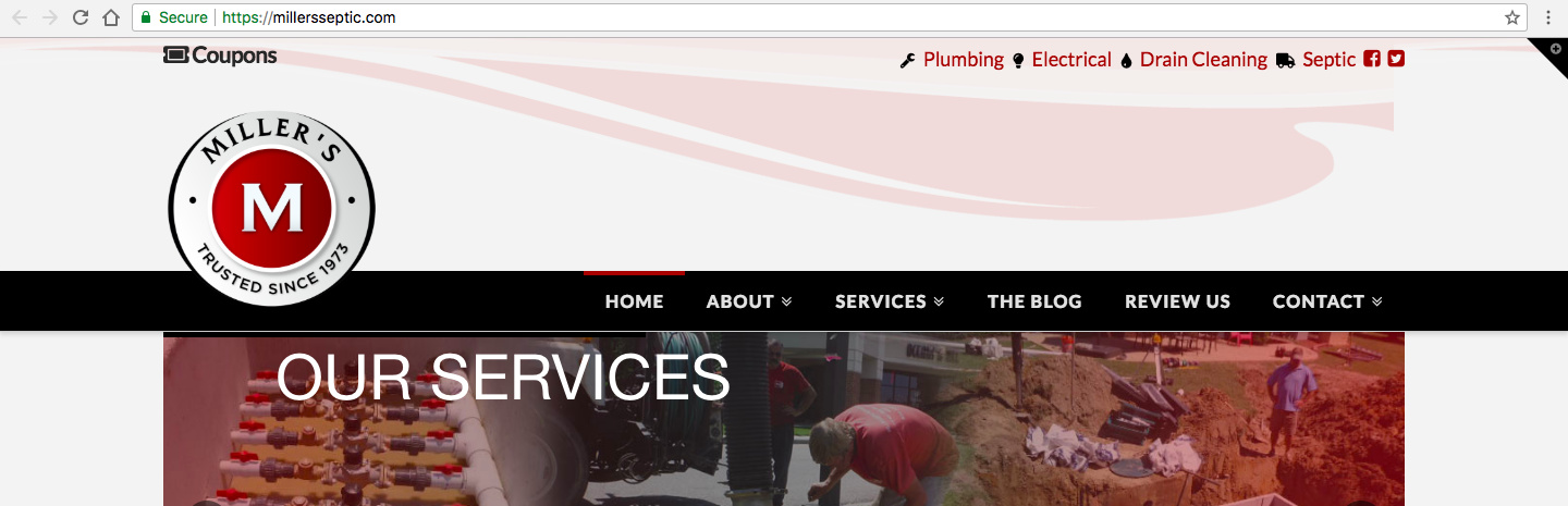
Let us know how it goes.
Thanks.
This topic was automatically closed 10 days after the last reply. New replies are no longer allowed.