Hello @ewk99,
Thanks for writing to us.
For your Query 1
You can use this custom CSS code to align the phone number in the mobile view under Cornerstone—>Theme Options—>Global CSS
@media (max-width: 480px){
.call-button, .text-button {
    margin: 0 auto;
    display: block;
}
.custom-text span {
    display: block;
}
a.call-button {
    display: block;
    margin: 0 auto;
}
}
Query number 2
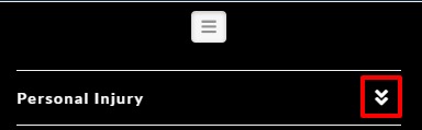
In case if you are talking about the submenu arrow, it is there for the user so that the user can understand there are more menu items. Please have a look at the screenshot given below.
In case if you want to hide it you can use this custom CSS code.
@media (max-width: 961.99px){
.x-sub-toggle {
    display: none;
}
}
Query number 3
For the footer map area background color. You can use this custom CSS code.
footer.x-colophon.top {
    background-color: #fff;
}
Please feel free to change the color code as per your design.
Please note that the code provided above serves as a guide only and it would ultimately be your responsibility to take it from here. If you are unfamiliar with code and resolving potential conflicts, you may opt-in on our One service for further assistance.
Thanks
