Dear all,
Thank you so much as always your work is great!
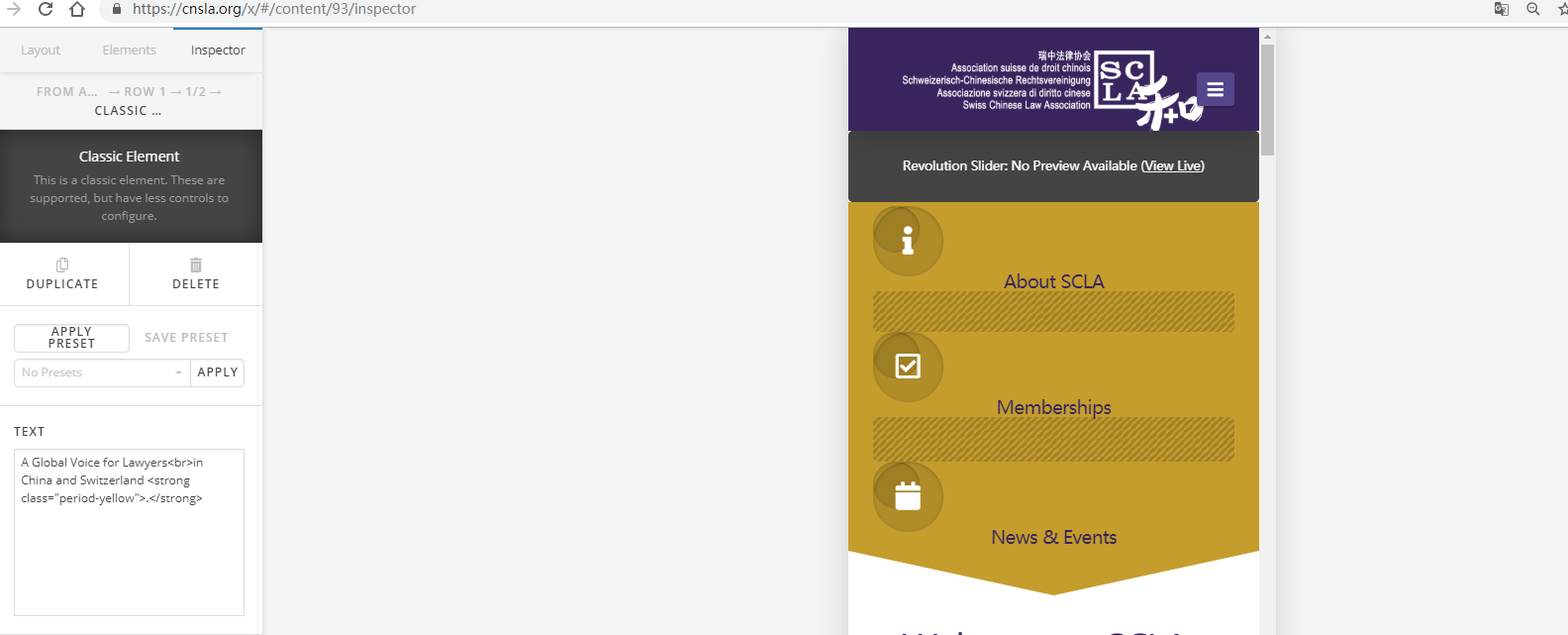
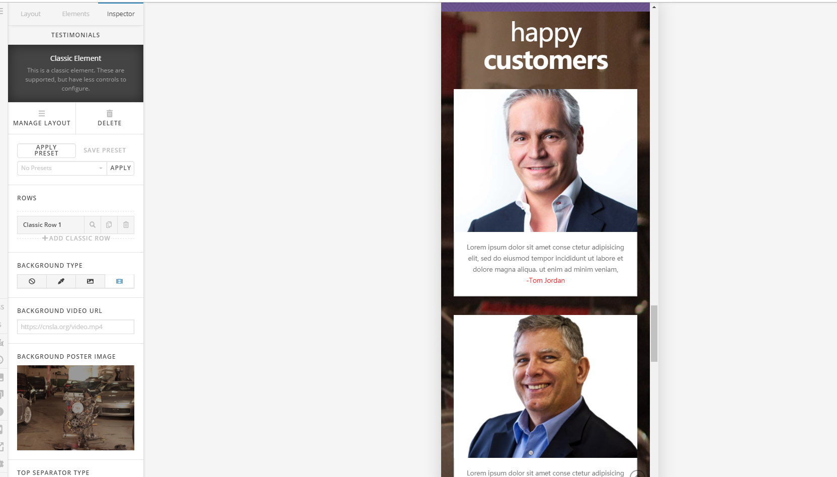
These two parts are simply toooo big in the mobile version, is there any way to adjust them? Thanks!
Dear all,
Thank you so much as always your work is great!
These two parts are simply toooo big in the mobile version, is there any way to adjust them? Thanks!
Hi Tianze,
I tried checking your website but I can’t seem to find the page with the sections shown in the screenshot.
However, based on the screenshots you have posted, those columns look normal because by default, they get stacked to each other and fills 100% of the device width on mobile devices.
Hope this helps.
Thank you very much Jade! How can i adjust them??
Hi Tianze,
Try adding mobile-adjusment on the column class field.
Then on Page custom CSS, add the following:
@media (max-width:480px){
.mobile-adjusment{
   margin: 0 auto;
   max-width: 480px; /*Adjust the width to your preferred size*/
}
}
If this didn’t work as you expected, please share the URL with the issue and also a screenshot on how exactly you want it. Thank you.
Dear Lely,
How to add mobile adjustment?
Thank you!!
Hi Tianze,
Please follow these steps:
#1. Click on the element that is in the column.
#2. Once you clicked on the element, the element setting will open in the left panel.
#3. Click on Column
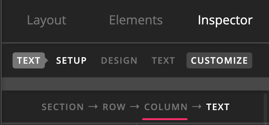
In the example above, I clicked on a text element
#4. Click on the customize option:
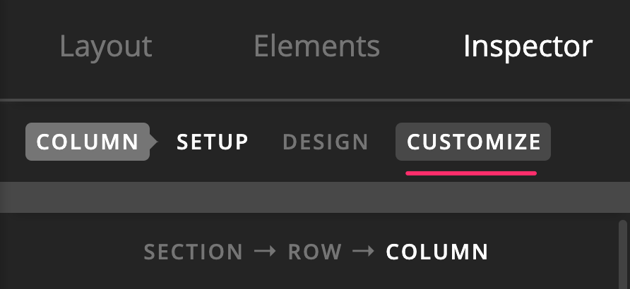
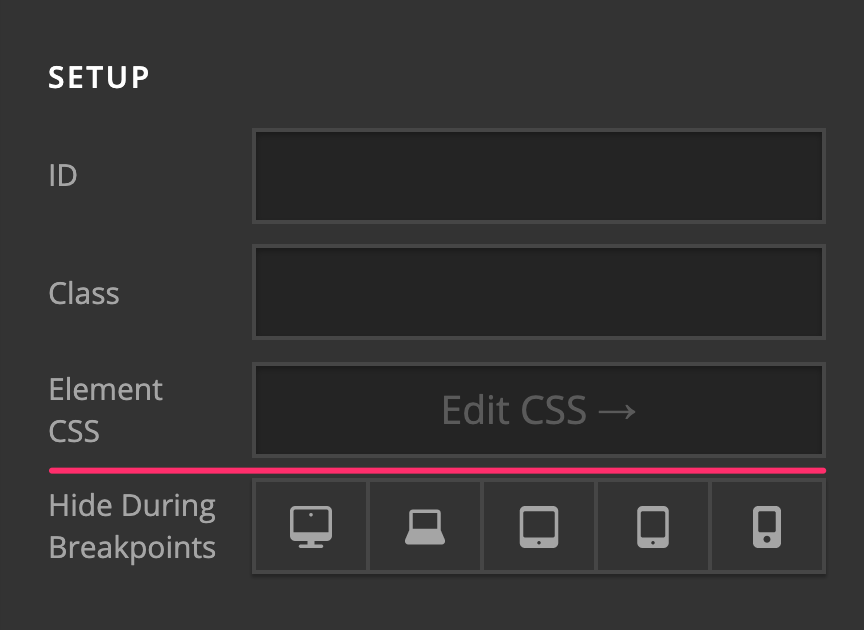
#5. You will see several options and one of them is the class field.
Hope this helps.
Dear Jade,
Thank you for your reply!
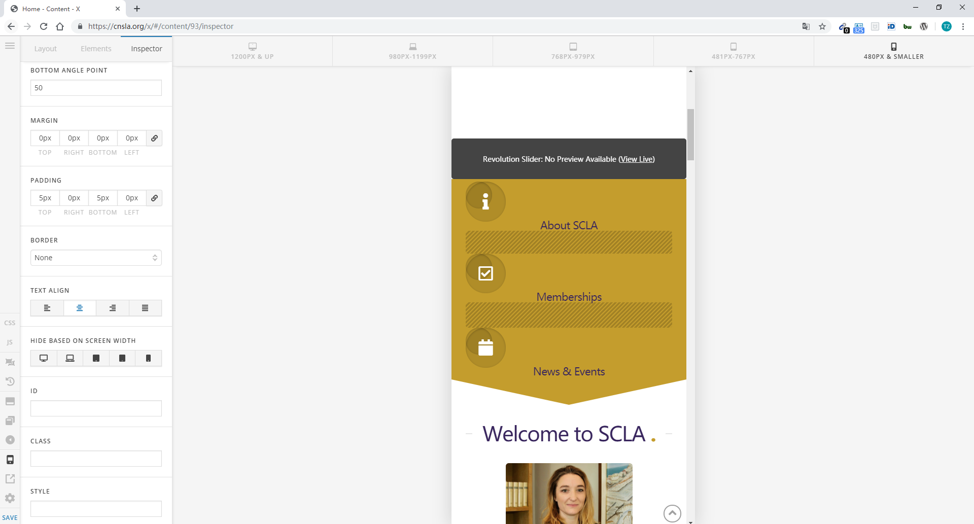
It seems only work with the text. Here, for example, the yellow part is too big in the Mobile versiton. We would like all the words and column be in the one row now 3 rows. How can we do? Thank you!!
Also we could not find the element CSS in this section
Hi Tianze,
What you can do instead is to add display: flex; in the style field of the row settings:
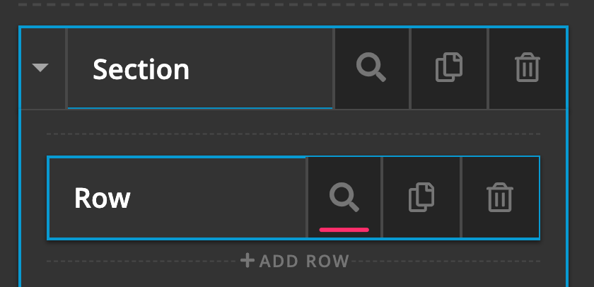
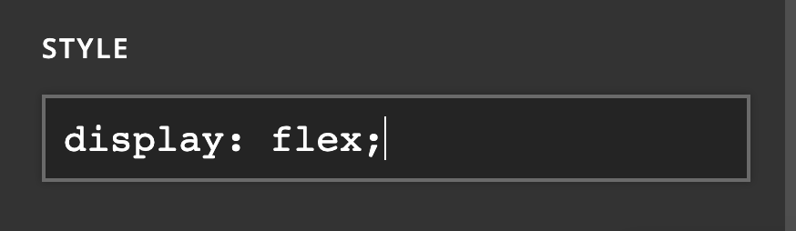
This will force the columns in the row to display side by side even on mobile devices.
To learn more about the Inline CSS, please read here: https://www.bitdegree.org/learn/inline-css
The element CSS is only available for V2 elements. Since the section you are using is a Classic section, you cannot see this option.
Hope this helps.
This topic was automatically closed 10 days after the last reply. New replies are no longer allowed.