Hello lovely people,
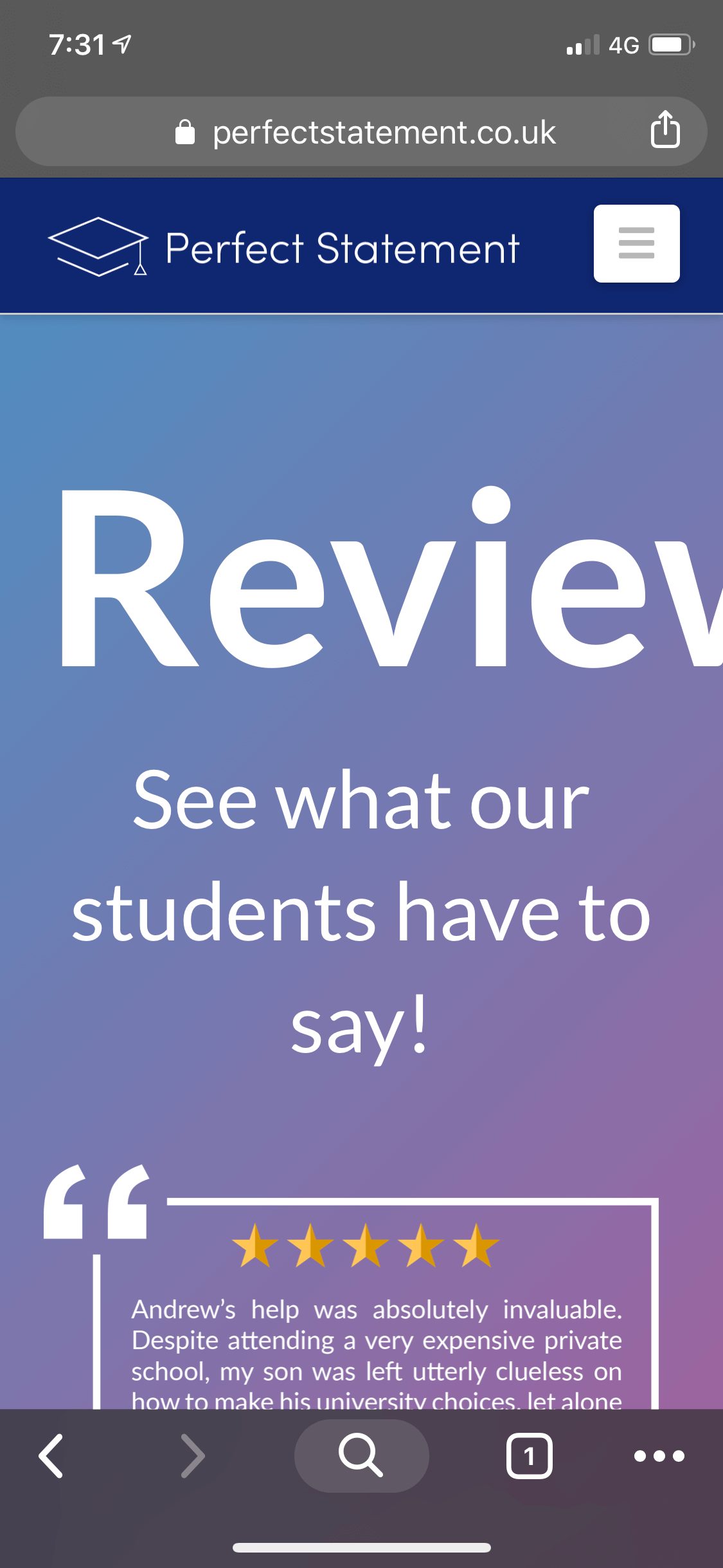
I’m having an alignment issue with one of my webpage titles (please find the attached screenshot) when using on my phone.
Would love you receive your advice.
Thanks
Hello lovely people,
I’m having an alignment issue with one of my webpage titles (please find the attached screenshot) when using on my phone.
Would love you receive your advice.
Thanks
Hi Andrew,
It looks the screenshot you sent got cut off. But I scanned around your website and found the Reviews page (https://perfectstatement.co.uk/reviews/) to probably be the page that’s on the screenshot. I see it indeed has an alignment issue. But if there’s some other page, the solution I’ll propose here will be applicable to it.
So, I noticed that the headline for “Reviews” is bigger (a lot bigger) compared to the headlines of the other pages. It is using 6em while the About Page, for example, uses just 3.4em.
Making the font-size smaller, will automatically solve the problem in mobile devices.
That said, if it’s absolutely necessary to keep 6em on desktops and laptops, then the solution is to reduce its font size on smaller devices only like tablets and mobile phones. To do that, “Inspect” the Text Element that contains the “Reviews” headline, then click the Customize tab.
You’ll see a field named, “Element CSS”. Click the “Edit CSS ->” Then enter the CSS code below:
@media (max-width:767px){
  $el.x-text{
     font-size:3.4em;
   }
}
What this code does is for devices with a width of 767px and below the font size of the Reviews headline will change from 6em to 3.4em.
This should solve the alignment issue - because it’s caused by the size of the font.
Hope this helps.
This topic was automatically closed 10 days after the last reply. New replies are no longer allowed.