Hi there,
I notices that when I look at my website on my IphoneXr screen I see 3 colums, wheras when I check in the preview for smaller screens in Wordpress itself, it’s one column (the colums are stacked under each other, as they are supposed to). Can you please help me to fix this?
Thanks! I will leave the password & url in the secure notes.
Sarah
Hello Sarah,
Thanks for writing in! You are having this issue because you are using the classic section, row and columns.
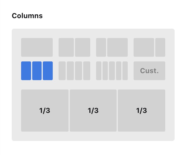
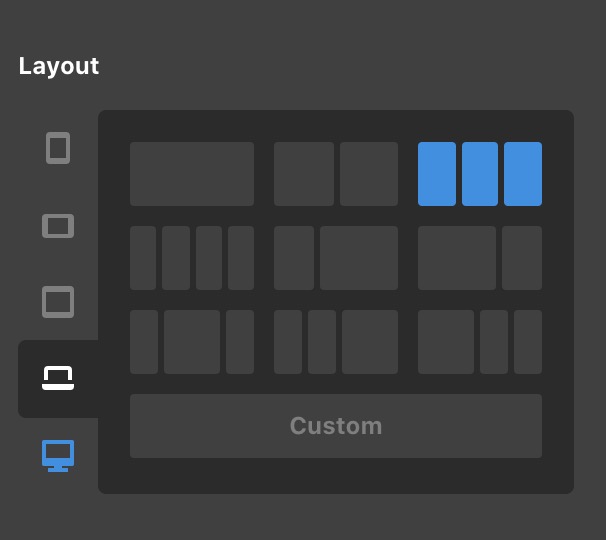
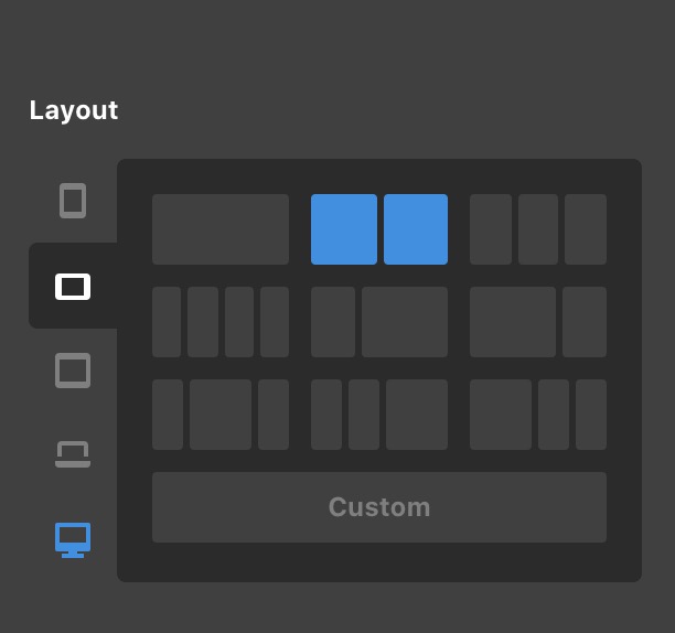
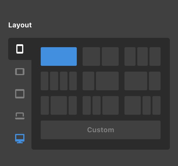
The classic column layout does not have responsive capabilities. To get this resolved, please edit your page, recreate the section using the new section, row, and columns. On the column layout in the row settings, set the number of columns to display in respective screen sizes.
Large:
Small:
Extra Small
Hope this makes sense.
Hi, thanks, so much for your support. Can you tell me how to change the lay-out from the ‘classic’ section, row and colums to the ‘new/modern section’ without losing content?
Maybe in the new section I can see the different column options for the screen sizes ;-)?
Thanks in advance!
Sarah
Hello Sarah,
Regretfully there is no option to convert the classic sections, rows, and columns to the new elements. You will have to recreate the page using the new elements instead.
Hope this helps.
This topic was automatically closed 10 days after the last reply. New replies are no longer allowed.