Hi there,
we have a problem with last section (kontakt) on our website palimeovocie.sk. It is ok on monitor but on mobile resolution the data are not readable.
Thanks
Michael
Hi there,
we have a problem with last section (kontakt) on our website palimeovocie.sk. It is ok on monitor but on mobile resolution the data are not readable.
Thanks
Michael
Hello Michael,
Thanks for writing to us.
I checked your site it seems that you have done style customization, there is an inline style rendering that is causing the issue. Please have a look at the given screenshot given below.
You need to remove the custom inline padding or you can use this custom CSS code to display the text properly. Add this code under Theme Options—>CSS
@media(max-width:978.98px){
div#kontakt .x-container {
    padding: 0 10px !important;
}
}
The purpose of providing custom CSS is to show you how to add CSS code to your site. Writing custom CSS is outside the scope of our theme support. If you need more customization, you need to learn CSS and learn how to use the browser’s element inspector.In case you have no idea about coding you can subscribe to One where customization questions are answered.
Hope it helps.
Thanks
Thanks a lot guys.
Maybe just one new issue. Is there a way how to align text to the left but only on mobile version.
Thanks a lot
Hi Michael,
It is not clear which element you are using, but you can set a different alignment for the Mobile version by using the Responsive option. The screenshot below explains the Align option of the Column, which you will get by clicking on the Align label.
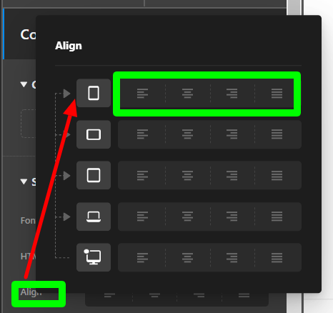
You will get similar options for the allowed attributes in other elements too.
Hope it helps.
Thanks
This topic was automatically closed 10 days after the last reply. New replies are no longer allowed.
