Theme issue with slider

Hi,

I have a homepage slider that is not keeping the font size when in mobile mode. https://testbed.garyoreilly.co.uk/

Text on sliders looks good on laptop, shrink down and in mobile mode it shrinks down to be too small to read.

Happy to send logins for you to take a look if that will help.

Thanks,
Neil

Hi Neil,

To make the text responsive, please take a look at this article:

https://www.themepunch.com/faq/incorrect-position-or-size-for-text-button-or-shape/

Hope it helps :slight_smile:

Thanks but that doesn’t help. I want the image to auto shrink down, so it all fits on the screen and doesn’t chop parts of the image off, top, bottom, left, right. But I want the text to always stay the same large enough size to be read. How do I just set the text for different device sizes?

Hi Neil,

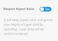
There are responsive settings like Respect Aspect Ratio under slider settings which you can activate and test. Please check the following video walk-through (https://www.youtube.com/watch?v=iyuxFo-WBiU).

You will also need to test your slider on different device widths and make necessary adjustments as they needed. You can learn more about it by following this video walk-through (https://www.youtube.com/watch?v=OIJShHQlMx0).

Thanks!

This topic was automatically closed 10 days after the last reply. New replies are no longer allowed.