The position of the Status indicators

Hi!

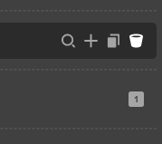
The New status indicators are placed to the far right, where the “Delete” icon used to be.
image

Great thing about deleting multiple sections was the fact that we were able to keep pressing the Delete icon multiple times.

Now, if the section has anything that would turn the status indicator on, it moves the trashcan to the left, so this great UX is not applicable anymore.

I know this is tricky to decide, but personally I’d have no objections if the trashcan was always to the far right, and the indicator is to the left of it. Or some other solution. :slight_smile:

We ran into this as well, and tried a few things but ended up landing where it is. The actions (inspect, duplicate, delete) only appear on hover, so it’s kinda weird if the status icons are in different positions. Also, the status icon relies on a tooltip so we can’t shift it around. We could move all the actions inward, but then there’s this awkward spacing.

Definitely a valid point on how it breaks down the quick deletion of elements. I’ll get with Kory and we’ll think on it a bit more in case there’s any other alternatives or compromises.

1 Like

This topic was automatically closed 10 days after the last reply. New replies are no longer allowed.