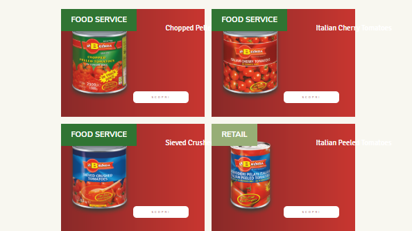
Can anyone tell me if it is possible to create a responsive layout for my custom skin: text and button on the right! in attachment screenshot image.
Link: http://www.pixelcreativi.it/pomodori/
Thanks for your support!! 
Can anyone tell me if it is possible to create a responsive layout for my custom skin: text and button on the right! in attachment screenshot image.
Link: http://www.pixelcreativi.it/pomodori/
Thanks for your support!!
Hello @fra_fantasy,
Thanks for writing in! Yes, it is possible. You will need to edit your grid skin and make sure that you use em for the font size and the line height so that responsive typography can be applied to the grid. You can check out the responsive typography settings in X/Pro > Theme Options > Typography.
To learn more about how you can properly edit theGrid skin, please check this out:
Hope this helps.
I selected EM in theme option and skin for the font size, but I don’t have good results (screenshot). what can I do?
Also, I’d like to align the two filters in the area. One on the right, the other on the left (screenshot).
i tried with this code,
I’m waiting for you for advice
/* Filters holder */
.tg-grid-wrapper .tg-grid-area-top1 .tg-filters-holder:nth-child(1){
float:left;
}/* Filters holder */
.tg-grid-wrapper .tg-grid-area-top1 .tg-filters-holder:nth-child(2){
float:right;
}/* Division */
.hentry .x-col .tg-grid-area-top1{
top:-60px;
}/* 1000px and below screen sizes */
@media (max-width:1000px){/* Division */
.hentry .x-col .tg-grid-area-top1{}
}
Thank you for your support. I’m desperate!  !
!
(upload://2HdWESgzOBASMVq8vqT6AIG4Sl7.png)
Hey @fra_fantasy,
Try using 12px minimum in the Typography options like the following screenshot. That is because you need to have a “base” font size in px because the em unit basically relies on its parent font size so if your base or root uses em, you have nothing to get a value from.
Responsive typography is not the entire solution to your problem though. There’s a range of screen sizes that even if you make the font size really small, due to the size of the grid item, it will not be legible. I’d recommend you select 1 column on portrait tablet view.
Hope that helps.
unfortunately I don’t have a good result. 
I reduced the padding of the page and it seems to be better.
What do you think?
Thanks!!
Hi @fra_fantasy,
Yeah, it’s better now, but I think you need to reduce the headline’s font-size and line-height a little bit.

Thanks,
This topic was automatically closed 10 days after the last reply. New replies are no longer allowed.


