Hey there,
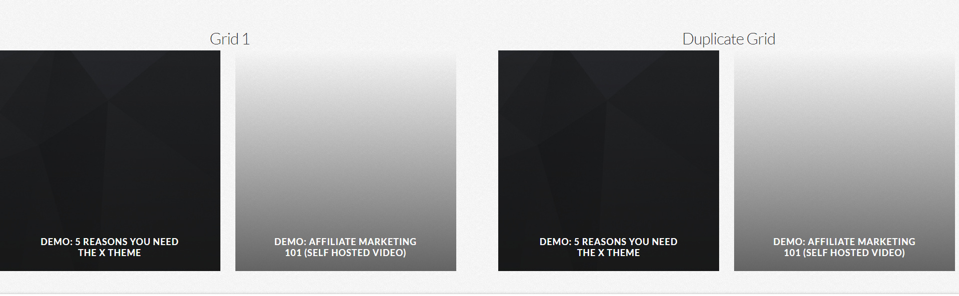
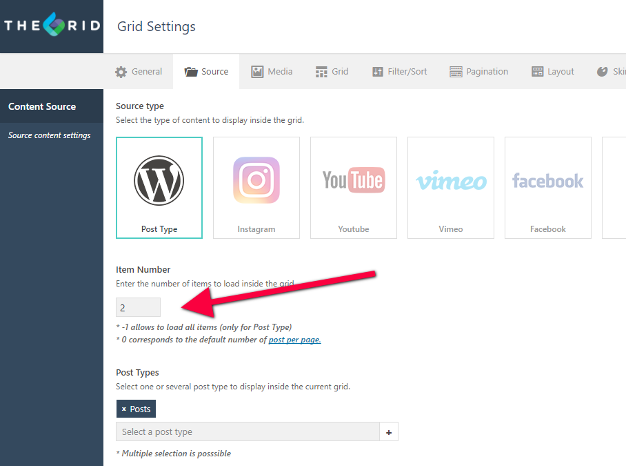
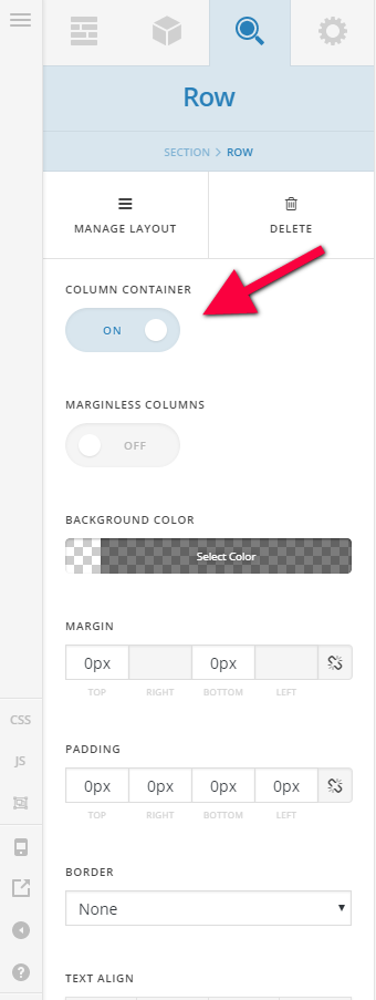
On my site: oneworldtrek.wpengine.com user: demo pass: oneworld1, I’m having trouble getting a few different grid elements to display properly. On the homepage, halfway down, there are two columns “2017 Featured Journeys” and “SMALL GROUPS & BIG ADVENTURE IN THE HIMALAYAS & BEYOND”. I have those as a row within the section, and divided into 2 columns. On the left under 2017 Featured Journeys, I have the grid "[the_grid name=“Yearly Featured”] and in the right column I have [the_grid name=“Monthly Featured”].
I cloned monthly from yearly, and they both have the same settings, but I cant the monthly column to display properly. As you can see, the two on the right are very small, and when I force full width, like the Yearly one is set to, it pushes the entries all the way left and under the other two entries so they aren’t visable.
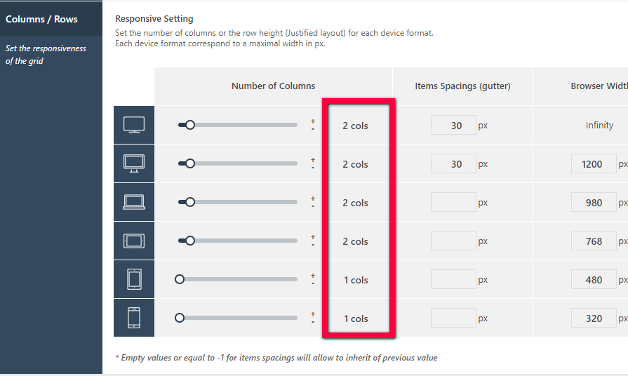
I have tried everything I can think of to fix this, but I haven’t been able to. I’d just like both columns to display 2 responsive grid elements that take up the whole area of the 1/2 column.
How can I fix this?
Thanks for the help!
Marcus