Hi. I’m having trouble targeting “The Grid” with my own custom CSS.
I need to make some modification for mobile only. I wan’t to make the padding in the white space 15px instead of 45px on mobile, but i can’t seem to target the proper class. Can you help me do that?
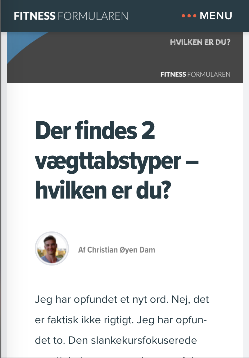
The other thing i want, is to make the button larger on mobile only. So i would like to hide the small button on mobile and show a larger one on mobile, which i will hide on PC. Makes sense?
And the last thing is, that i want the headline to be 44px on PC and only 28px om mobile too.
Here’s the page: https://fitnessformularen.dk/blog/ - And thank you very much! 