Hello!
The text is not wrapping correctly in a text content area on the mobile site. It’s the Emphasis on Recovery section.
http://new.actsrecoveryhomes.com/
Thanks for your help.
Hello!
The text is not wrapping correctly in a text content area on the mobile site. It’s the Emphasis on Recovery section.
http://new.actsrecoveryhomes.com/
Thanks for your help.
Hey @janfox,
It’s because of a custom CSS. I’ll show you that custom CSS for now but next time, please temporarily remove all custom CSS to check if it’s the features of our theme that’s causing the issue.
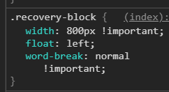
Please remove the custom CSS you’ve most probably added in Theme Options > CSS and either use the New Row or Grid layout system. Check out the video tutorials below. Both systems offer responsive layouts per screen size so you can show, for example, 2 columns on desktop and 1 column on mobile.
###Grid
###New Row
Hope that helps.
Hi @christian_y,
Thanks for the reply. I’m so glad you brought up adding the grid and new row. When I add a new section, row or the grid, I don’t get all of the lovely options that are in the template sections so I have to duplicate a pre-configured section which doesn’t provide the option to choose layout for the new section.
Here are the options available in the template sections that are not available in the sections when I add them.
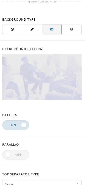
This is what I get. I do not get the ability to add a background image or paralax so have to duplicate a template section which then does not allow me to choose the layout. The grid does not work the way it does in your video either.
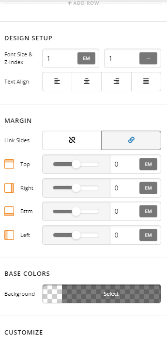
Please advise. Thanks for you help.
I did find The Grid plugin, but that is not what I need. If adding a row or a section contained all the elements shown in the video, all would be good. How do I activate those elements?
Thanks much
Hi @janfox,
I understand that new things can be hard to learn sometimes, but just continue learning one feature at a time 
Please enable the Advance Mode this will give you all the options on an element.
If you do not see that option on your end, please navigate to X or PRO > Settings > User Preferences > Advance Mode and set to Always On.
Now let’s go back to your original issue, like Christian said this is the custom CSS that causing that issue.
.recovery-block {
    width: 800px !important;
    float: left;
    word-break: normal !important;
}
Notice that width: 800px !important; that’s a fixed width regardless of the screen size, so when you view your page on mobile (smaller screen than 800px) you got the overflowing text issue.
You can resolve that, by changing the width: 800px !important; to max-width: 800px !important;
Hope that helps,
Cheers!
Thank you so much! Ya’ll are AWESOME!
You are most welcome.
We’re just glad we were able to help you out.
This topic was automatically closed 10 days after the last reply. New replies are no longer allowed.

