Hi There,
I am having with some issues with text on the home page of a new site. It’s not resizing for my iPhone 6.
More info in a secure email.
Thank you!
Hi There,
I am having with some issues with text on the home page of a new site. It’s not resizing for my iPhone 6.
More info in a secure email.
Thank you!
Hi there,
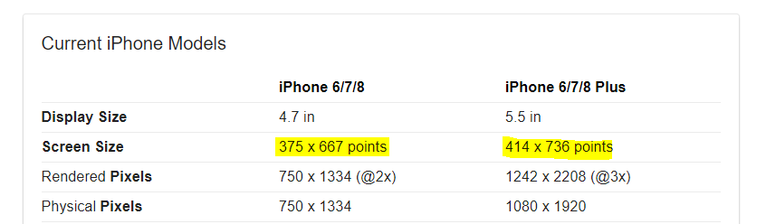
Thank you for reaching out to us. I checked your CSS and I see an issue with your media queries, you’re using (min-device-width: 480px) and it won’t work for an iPhone 6 or iPhone 6 Plus because you’re targeting the minimum width of 480 but the screen size of iPhone 6 is 375 x 667 and iPhone 6 Plus has 414 x 736, so in order to make your media queries work please change this line of code (min-device-width: 480px) to (max-device-width: 480px) and it should work for your iPhones, however if you want to target the larger screens like iPads or tablets then you should change with max-width to 768px so your code will be (max-device-width: 768px)
To learn more about media queries please see https://www.w3schools.com/css/css3_mediaqueries_ex.asp
Hope this helps!
Hey Nabeel,
Thank you so much for the solution. It worked beautifully! And now I’ll go back in and adjust the font-size etc.
And thanks too for the info on media queries. It’s even better to not only get the solution but also to receive further instruction so I can learn more and not have to bug you!
Many thanks again to the world’s best support team!
Best Regards,
Nancy
Glad we could always help, and you’re most welcome!
This topic was automatically closed 10 days after the last reply. New replies are no longer allowed.