Text Does not appear good on phone screens

Hi, I have created a header. It looks great on a desktop, but not on mobile screens. The text cuts off on the mobile screens.

Here is the link for my site: https://www.gospelheritageministries.org/

Please check it on desktop and mobile browser as well.

Thank you,
Joel.

Hello Joel,

Thanks for writing in!

Your column is way to wide for smaller screen. I can see that you added 12.5vw which may have been the cause of the issue. To better assist you with your issue, kindly provide us access to your site so that we can check your other header settings. Please create a secure note with the following info:
– Link to your site
– WordPress Admin username / password

To know how to create a secure note, please check this out: https://theme.co/apex/forum/t/how-to-get-support/288

Regards.

Hello @joelmadasu,

I have logged in and edited your header. I changed the 12.5vw to 12.5% instead.
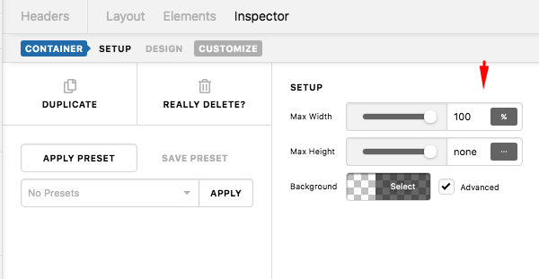
And then I have added a maximum width for the container.

Please check your site now.

This topic was automatically closed 10 days after the last reply. New replies are no longer allowed.