Hello, the text is cut off on mobile phone. I have width set on auto everywhere. Is there some other setting that I can adjust to prevent this?
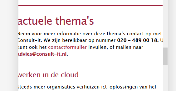
Hello, the text is cut off on mobile phone. I have width set on auto everywhere. Is there some other setting that I can adjust to prevent this?
Hi Karin,
Try adding this css, it will add left and right padding when viewed in a mobile or when the browser width is small.
@media(max-width:767px){
    .entry-content.content {
        padding-right: 20px;
        padding-left: 20px;
    }
}
Hope it helps.
It did! Thanx so much!
You’re welcome!
We’re glad @Albrechtx solution works out for you.
This topic was automatically closed 10 days after the last reply. New replies are no longer allowed.