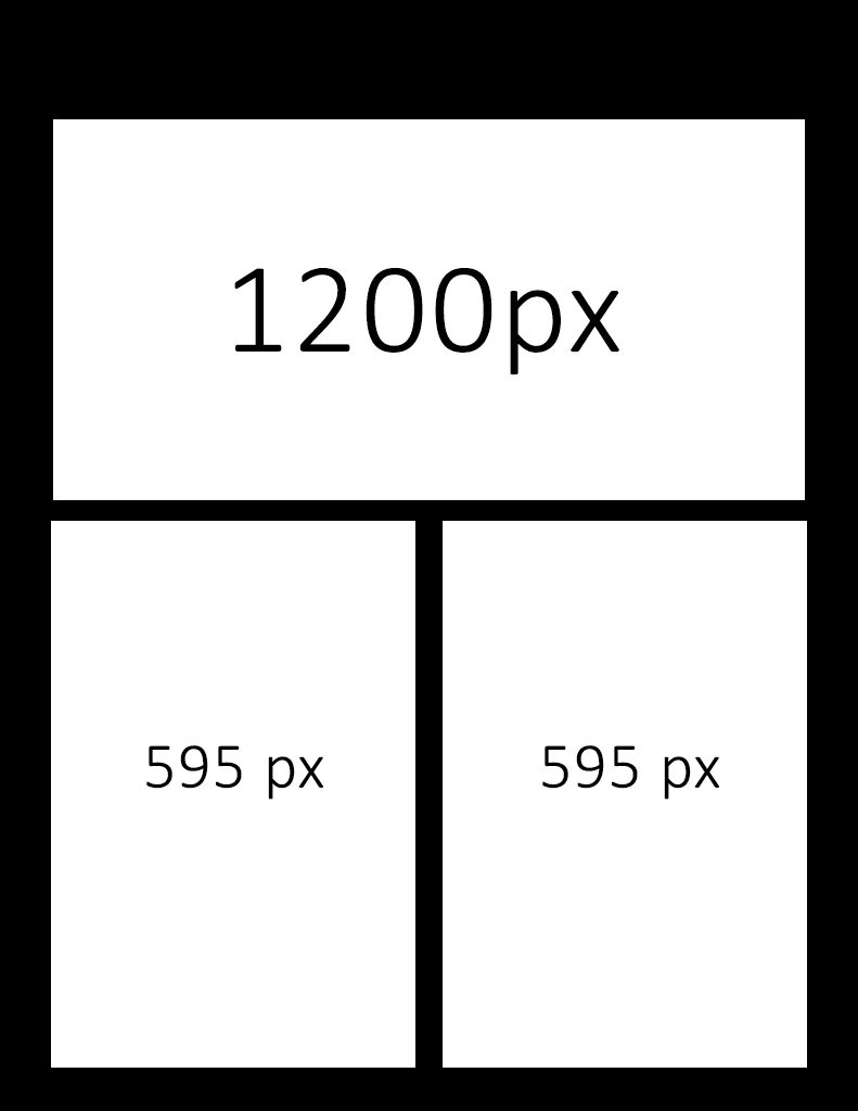
I need help with a feature. I run a photography website on Integrity Stack and i have some problems displaying my pictures. There are 2 formats of pictures that i want to display: landscape (1200 x 800 px) and portrait (595 x 853px). By default the theme resizes the tall image to fit the whole width and that makes it incredibly large for any desktop/laptop screens. I want to group the tall ones 2 per row because they look so much better and in the mean time maintain the responsiveness etc. I have about 40-50 images per post.
Can it be done via css? I’ve also thought of using block grid but creating a grid for every 2 tall pictures is tiresome and it also adds white space (aditional padding and borders) between pictures.
Here’s some reference info:
https://silhouettes.ro/2017/09/17/nunta-catalina-liviu-16-09-2017/
I’ve also tried to reduce the width of the overall website to 900px so the pictures would fit a smaller width and therefore resize to a smaller number but that makes my homepage look shrunk and uneven.
Can i keep the frontpage at a custom width and the whole website at a standard width? I only need the homepage to be wider.
Is there any way to do this?
I’ve attached a demo of how i would like to result to be.
Thank you!
Sergiu