Hi could you please send me the fix for the following are not scaling properly on tablet.
dogaholics.ca
Thanks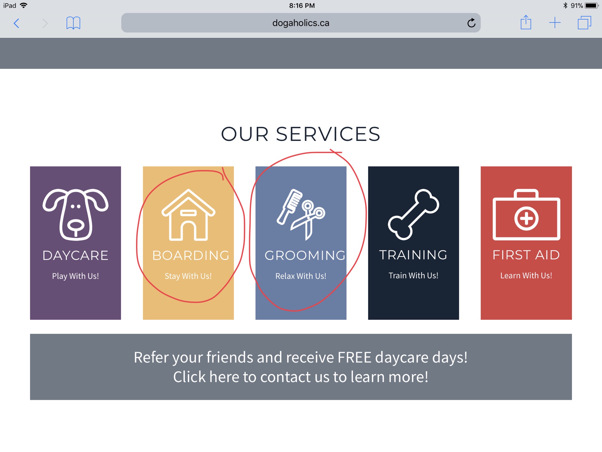

Hi could you please send me the fix for the following are not scaling properly on tablet.
dogaholics.ca
Thanks
Hey @macknak,
For the card title in your home page, I would recommend two ways. You can use one or both of them.
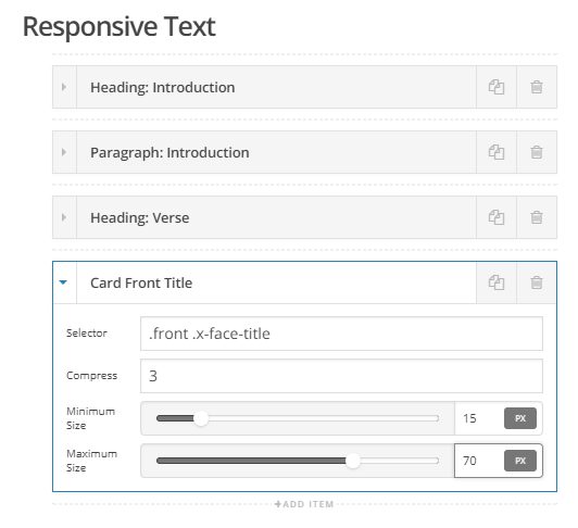
1 - Use Responsive Text for this selector .front .x-face-title and play around with the Compress, Minimum Size and Maximum Size values.
2 - Use HIDE BASED ON SCREEN WIDTH / Hide During Breakpoints feature to show 5 columns on wider screens and show 3 columns in smaller screens.
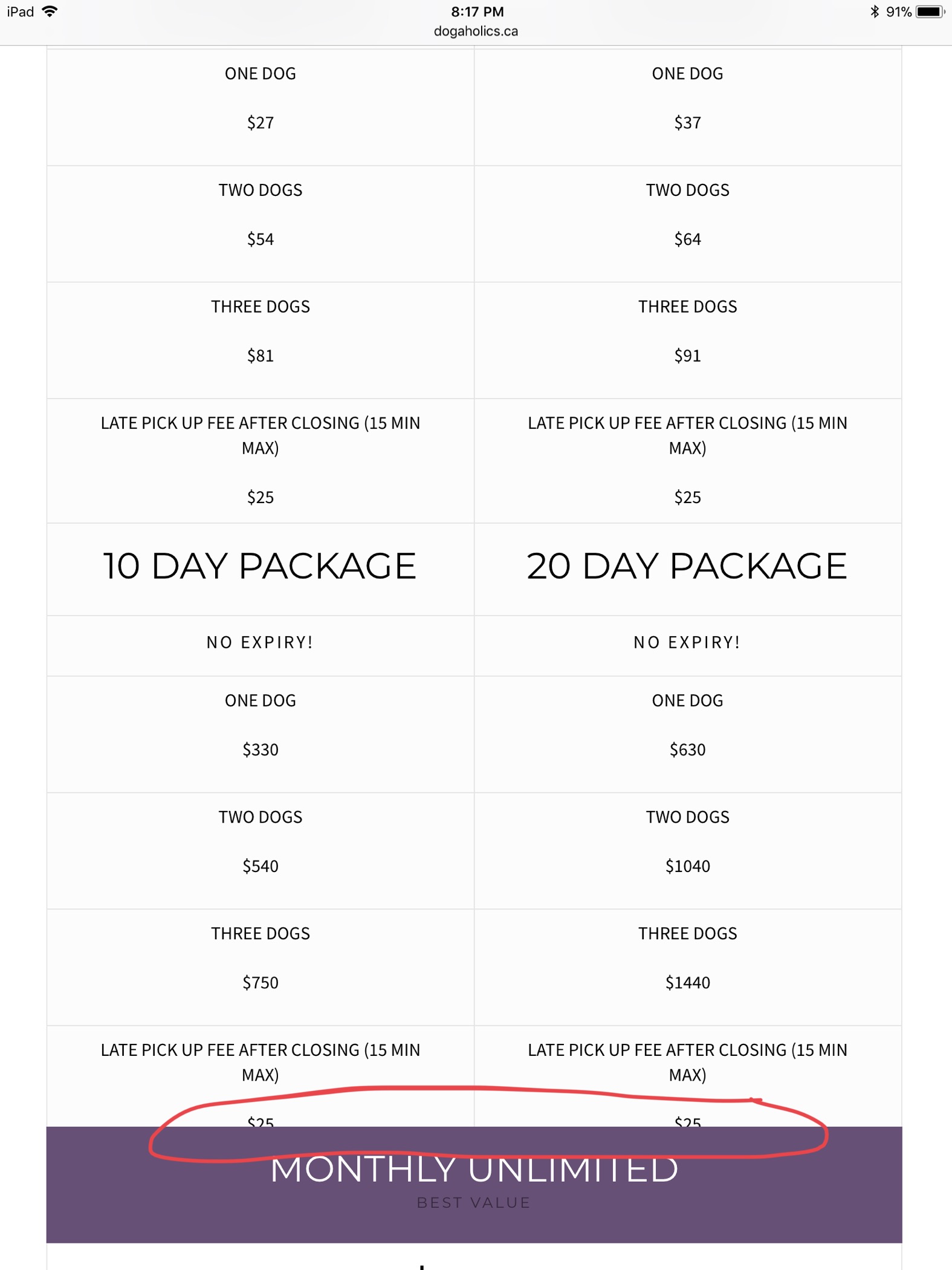
For your pricing table, add this code to your Global CSS. This looks like a bug and I’ll submit a report for this.
@media (max-width:979px) {
    .x-pricing-column.featured {
        margin-top: 0;
    }
}
Hope that helps.
worked great thanks!!
You’re welcome 
This topic was automatically closed 10 days after the last reply. New replies are no longer allowed.