Tablet Home page not rendering like Desktop and phone

Dear X Support,

My site - straitgateradio.com looks perfect on both desktops and iPhones. But on my Amazon Fire tablet, with either the Safari or Chrome browser, the Home page Text areas overlay the podcast play controls and make them inoperable. Please take a look.

There is one problem on the iPhone as well. The podcast controls work, but the GO TO PODCASTS control (on the Home page) has to be pressed twice to get it to work. On the LISTEN HERE page, which has all the podcasts, a single press plays the podcast, but on the control line to switch to a text version of the podcast, two taps are necessary to get it to work. On a desktop, a single click does the job for both.

Can you tell me how to resolve these problems please?

Thanks
Hi Craig,

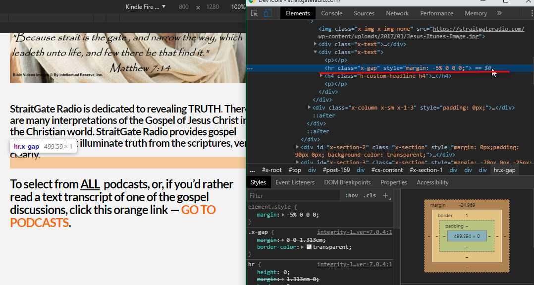
Thank you for writing in, I see that you’re using a negative value Gap element on some of your text, please refrain from doing that as that gap element can overlap on other elements specifically on a responsive view. Adjust your text/headline elements margins instead if you need spacing between elements, you can use Gap element but not with negative value.

Regarding the second issue, that is a behavior of some iOS device where on the first tap it will trigger the :hover effect and the second tap for the actual click event. Please follow this link for more details about that behavior.

Hope it helps,
Cheers!

Thanks very much. You guys are the BEST!

Cheers back,

Craig

We are happy to assist you with this.

Have a nice weekend,
Cheers!

This topic was automatically closed 10 days after the last reply. New replies are no longer allowed.