Table inside accordion columns collapse in mobile

I’ve built a pricing table inside an accordion. I’ve got it looking how I want it on medium and large screens but on mobile screen sizes the columns all show separately. I’ve tried some css code to prevent collapsing but can’t get it to work.

Page is: 2018.portsmouthmusicacademy.co.uk/music-lessons-guitar-lessons

It’s the ‘View Lesson Prices’ accordion in the first section.

Thanks for your help as always :slight_smile:

Hi Adrian,

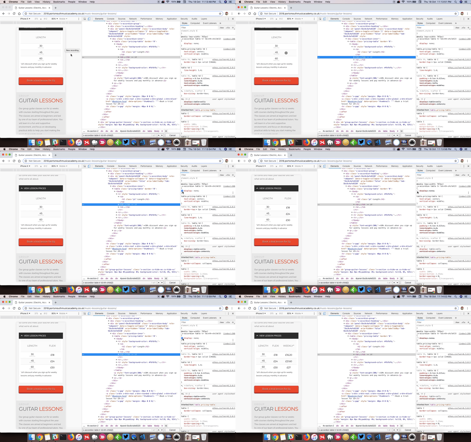
I checked and it looks like you are hiding columns 2 and 3 in mobile?

I can see you have the following code.

@media (max-width: 767px) {
.x-accordion table tr td:nth-child(2) {
     display: none; 
}

.x-accordion table tr td:nth-child(3) {
     display: none; 
}
}

If you remove it, this is how it will look in mobile.

Can you provide us screenshot on how it looks in your end.

Thanks

Hi, thanks for your reply.

Do you know where that CSS is? I can’t find it anywhere in additional CSS or anywhere else.

This is what the table looks like in mobile view:

Thanks

Hello Adrian,

Thanks for asking. :slight_smile:

I checked the website and it seems that you might have added the code in Theme Options panel CSS editor. Under X > Theme Options > CSS please check and remove the code.

Thanks.

Aha! Brilliant, thank you. That bit of CSS was still in from the theme demo which is why I didn’t even know it was there!

Thank you for your help

You are most welcome. :slight_smile:

This topic was automatically closed 10 days after the last reply. New replies are no longer allowed.