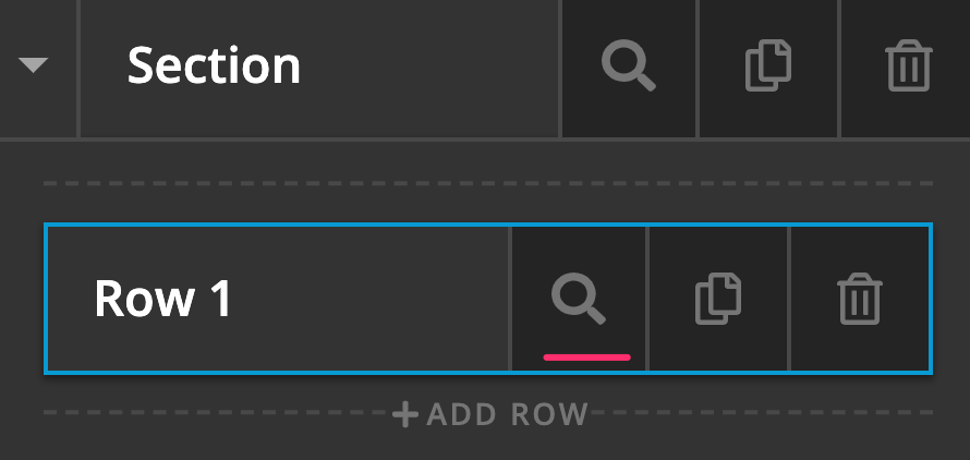
I found this code to help me, but i cannot for the life of me figure out how to put a class on a row in cornerstone with the advanced settings option turned on. I’m on regular X Theme for now, too scared of data/editting issues to switch to pro right now.
@media (min-width: 768px) {
.x-section .x-container.swapcolumns {
display: -webkit-box;
display: -ms-flexbox;
display: flex;
-webkit-box-orient: horizontal;
-webkit-box-direction: reverse;
-ms-flex-direction: row-reverse;
flex-direction: row-reverse;
}
}
where can I apply the code “swapcolumns” to the row so it will work for me?
jesse