I am having a problem with my sub-menus on a mobile device.
They don’t appear as expected, and there seems to be something weird going on, as though they are doing their best to appear, but don’t quite manage it.
I am having a problem with my sub-menus on a mobile device.
They don’t appear as expected, and there seems to be something weird going on, as though they are doing their best to appear, but don’t quite manage it.
Hi @Moonworks,
The submenu for the Inline Navigation does not show the submenus on mobile because it is a hover event that triggers the submenu items to show up and there is no hover even on mobile.
Also, the Inline Navigation is not ideal to use for the mobile view.
I suggest, hiding the Inline Navigation element on mobile using the Hide During Breakpoints option.

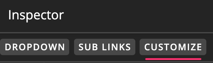

Then add a Navigation Dropdown element which you will hide on desktop screens using the Hide During Breakpoints option.
Hope this helps.
Sorry, I gave you the wrong link above.
It should be https://www.wessex.co
It’s the dropdown menu I’m having the problem with.
Hi @Moonworks,
The thing is the Navigation Dropdown is not suitable for extra small screen as well. As you can see the dropdown submenu shows up on the side, but on a very small screen (mobile portrait screen) there is no area on the side where the dropdown submenu can be a squeeze, that’s why the submenu looks like struggling to show up.
I advise to use the Navigation Collapsed or Navigation Layered element instead for mobile menu.
Hope it helps,
Cheers!
Thank you, that’s much better
This topic was automatically closed 10 days after the last reply. New replies are no longer allowed.