Hey there,
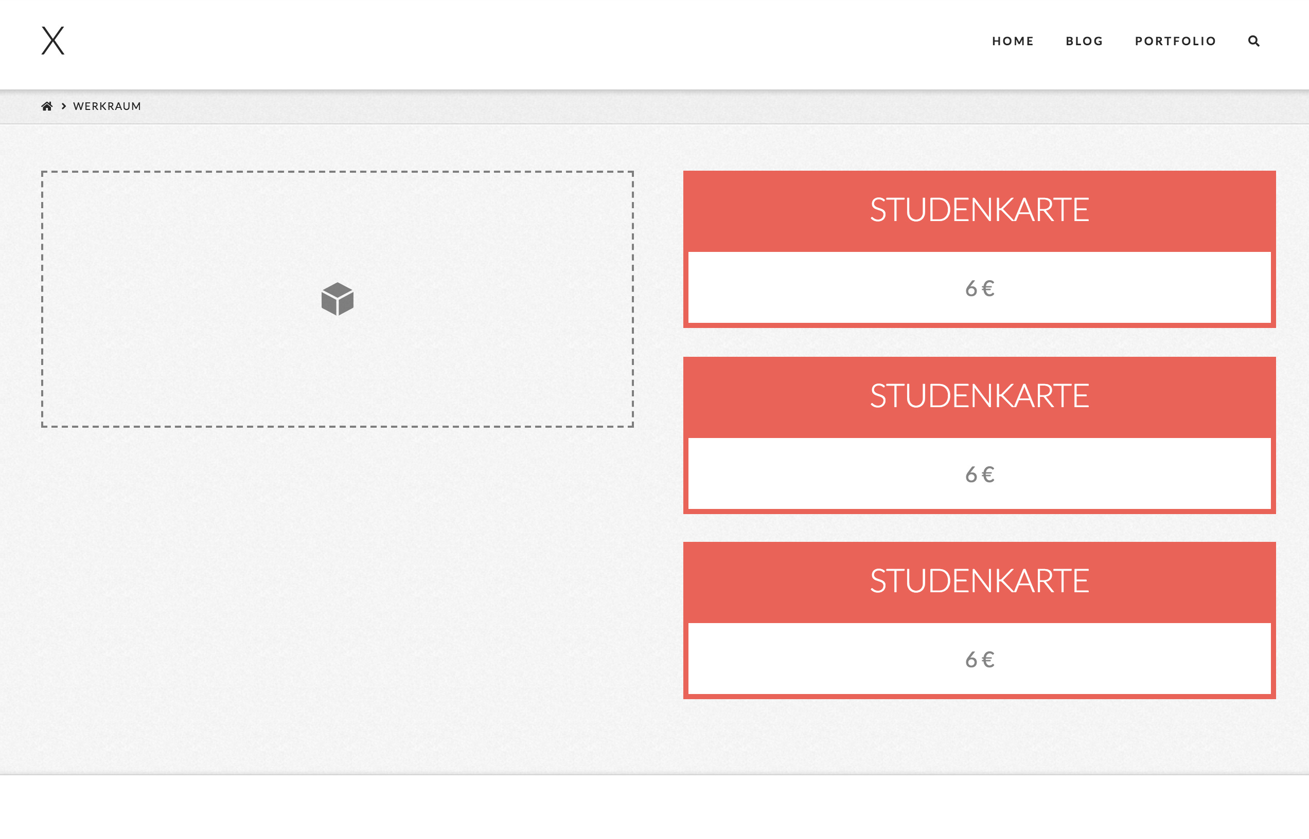
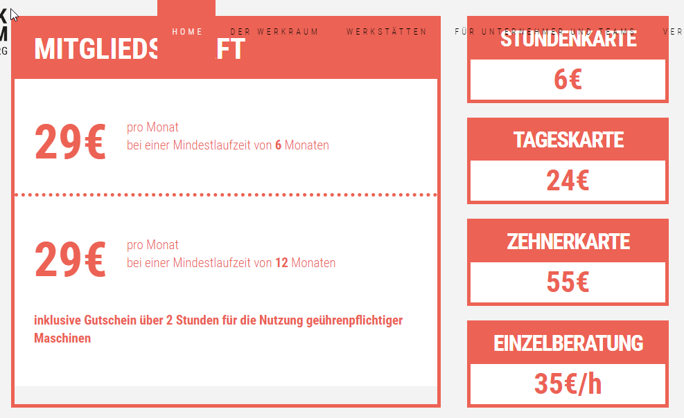
I’am styling a section right now and I need a hint on how to achieve following look.
Thanks for your help!
Denis
Hello Dennis,
I have check your desired layout and this is not possible if you only rely on using the columns because nesting of columns insert a column is not allowed in Cornerstone. You may need to use other methods in displaying this. You can make use of the classic block grid element. You can insert a heading and a text inside each block grid item. A custom css maybe to have the border or the background color of the headings.
Additionally, please check this video regarding the nesting of columns:
Hope this helps.
how about global blocks, would that be possible?
Hi Denis,
Actually, the layout that you’re aiming for the right column is possible with X with a bit of custom CSS.
Please try using the Classic Callout element for each boxes in the right column then add a common class to those elements.
Please place box headline text to the title field of the callout element then the price to the message field. Next is to set the alignment to center.
Once you added a common class to the callout elements, adding this code to the Global CSS should help you get started:
.red-box.x-callout {
    padding: 0;
    border: 0;
    margin: 0;
    background-color: transparent;
    border-radius: 0;
    box-shadow: none;
}

/* Remove the callout box button and container */
.red-box.x-callout .x-btn,
.red-box.x-callout:before {
    display: none;
}

.red-box.x-callout .h-callout {
  	color: #fff;
  	background-color: rgb(236,98,84);
  	padding: 20px;
  	font-size: 1.5em;
  	text-transform: uppercase;
  	margin: 0;
}

.red-box.x-callout .p-callout {
  	background-color: #fff;
  	padding: 20px;
        border: 5px solid rgb(236,98,84);
}
If you have correctly followed the steps above, you should have this result:
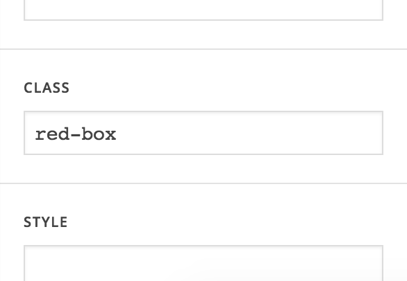
Please note that the code above assumes that the class you have added to the callout elements is red-box. If you used a different class, please change the class reference from the code I provided.
You will have to further style and add some more CSS for the callout boxes to look like the image file you posted but this should be enough to set you on foot.
Here are some related links for further reading:
- Intro to CSS - https://goo.gl/mFuWQT
- How to get CSS selectors - https://goo.gl/BmoH39
- Get Started With Viewing And Changing CSS - https://goo.gl/7xFhDa
Hope this helps.
thank you, this worked great!
how do I make this a headline and change the spacing between the callouts? http://prntscr.com/lef843
it seems like the spacing between the callouts is influenced, when I change the font size of the .p element in the the callout.
thanks for your help
Hi,
- To style the number you can wrap it in a
<span>tag and add aclassattribute.
eg.
<span class="my-amount">6€</span> Lorem ipsum
Then target that class to style that element.
.my-amount{
     font-size: 5em;
     color: rgb(236,98,84);
}
- Set the
margin-bottomofpelement to zero. Then add the margin to your callbout box instead.
.red-box.x-callout .p-callout {
    margin-bottom:0;
}

.red-box.x-callout {
    margin-bottom:50px;
}
Change 50px to adjust
Hope that helps
Thank you a lot, I got it now. How do I make this column the same size as the column on the right? http://prntscr.com/leiuyf
Thanks for your help!
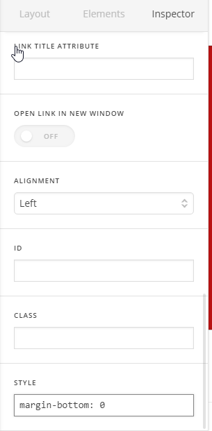
Hi There,
- Please add this inline CSS to your row:
display: flex; flex-flow: wrap;
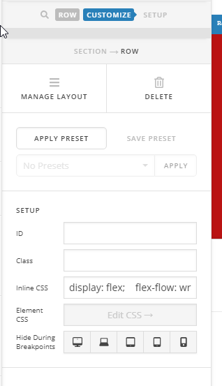
- Remove the bottom margin of the last callout by adding this line CSS to the last one:
margin-bottom: 0
- The result:
Hope it helps 
thank you, but this did not help. You can see it in your screenshot too, the background is chopped off for some reason
Hi @zerotoone.de,
You mean the white background? I just checked and it looks like fixed now.
Or is it the menu cutting through without background? Please provide information on what you’re referring in the screenshot.
Thanks!
No I removed the recommended code again, if you look at your screenshot http://prntscr.com/leoudc the background is bugged. beside this issue, the columns didnt have the same size
Hi Denis,
Please note that we mainly provide support for theme issues or setup. As for custom development, we would be able to provide some suggestions to get you started but not as much as the exact code that fits the design that you aim to achieve.
Also, it would be tricky to have the left and right contents of the section in question be equal as they are separate elements. You might want to try using some Javascript code.
Kindly check this link for more information about CSS flex:
In case you are not certain how to proceed, kindly contact a developer.
Thank you.
This topic was automatically closed 10 days after the last reply. New replies are no longer allowed.