Hello. I’m using Pro to design header. I see three dots show up in my header when viewed on mobile devices. Clicking them brings up a drop-down menu showing links from the sample menu.
See www.twinbranchbiblechurch.org. Thee green dots appear in smaller screen sizes.
Thanks.
Daniel
Hi There,
On Pro, different from X, the mobile menu and inline menu elements are independent of each other.
That allows the user to have much more flexibility when designing their headers.
In order to edit your mobile header, you can click on the mobile picture on the very left thin bar and then select the screen width you want to edit.
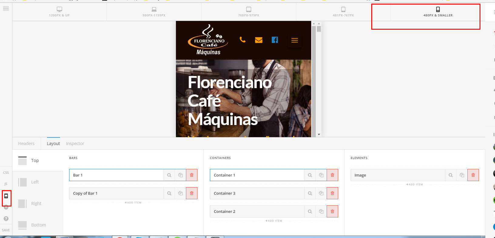
Not that on the header builder and on the footer builder, each element, container or bar have a Customize tab, on this tab you will find the option to hide the element based on the screen size.
So pretty much what is happening on your installation is that you have your inline menu set to be hidden under certain widths and your mobile menu element to be shown above those certain widths.
Once you have clicked on your mobile element, you can assign the menu just as you did on your inline menu element.
Hope it helps!
This topic was automatically closed 10 days after the last reply. New replies are no longer allowed.