Strange responsiveness when resizing window

Hi there,

I have a 3 column layout as per below:
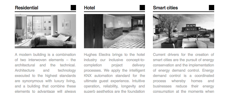
when I resize the window to around 675px wide (ipads and smaller screens), this occurs:
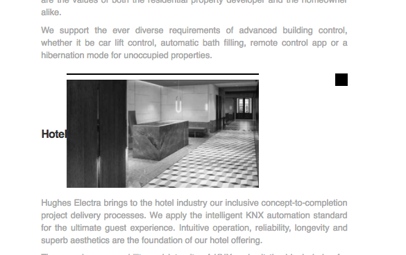
It then corrects at about 500px wide:
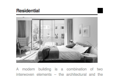
Not quite correct - the square button and text column are still too wide here.

Can you explain why this occurs at these sizes? How can I prevent this from occurring, and instead keep the picture taking up all of the width, with no interruptions from the title and square button?

Site is:
https://paddydeklee.com

Thanks :slight_smile: !

Hi There,

I tried to resize windows and this is what I saw: https://screencast-o-matic.com/watch/cblVV22a3K
Not exactly the way on your screenshot. Regarding the image, the scale part is coming from wordpress.com. Did you add that height and width parameter or is it automatic from wordpress.com too? Original image size is 640x360, but there’s a width and height parameter that set it to 350x197. 350px is not wide enough to cover that entire container and align with other content on the right.

Hi Lely, I haven’t added any custom parameters for image sizes.

I managed to semi-solve the issue by making the image display: block

Thanks for your help though.

Thanks for letting us know!

This topic was automatically closed 10 days after the last reply. New replies are no longer allowed.