Sticky Menu assigned according left column

Hi,

I’m working on a site and on one page I have my main menu on the top of the page and also this sticky menu on left which links to different parts of that page. The page has three columns (1/5 + 3+5 + 1/5) and I was wondering is there a way to make the left menu go aligned with the left sidebar when watching in different resolutions?
I’ve switched the left menu off from the mobile view.

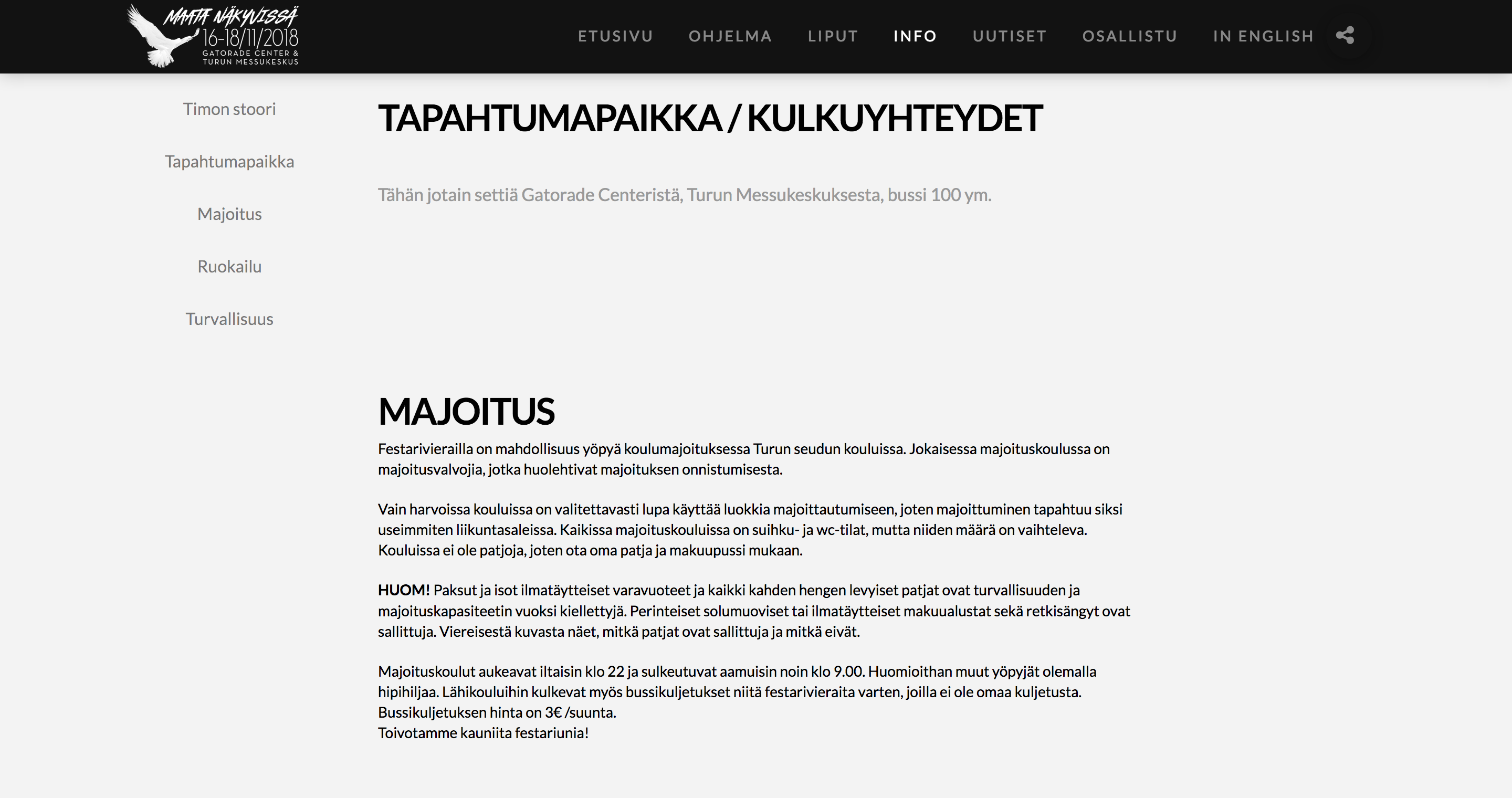
Here is a screenshot of my page.
Thanks!

Hey @hallauri,

I’m sorry but in your screenshot, I see the left menu but is that also the left sidebar? Please give clarify or give us more details and also the URL of your page.

Thanks.

Hi,
I sent the information through Secure Note. The menu is not left sidebar.

Thanks!

Hi @hallauri,

Not really sure of what you want to achieve because I could see also that your menu is on the left sidebar.

We’ll do our best to help you as soon as we understand the concern.

Let us know how it goes.

Thanks.

Hi,
Sorry for my lack of explanation skills. :slight_smile:
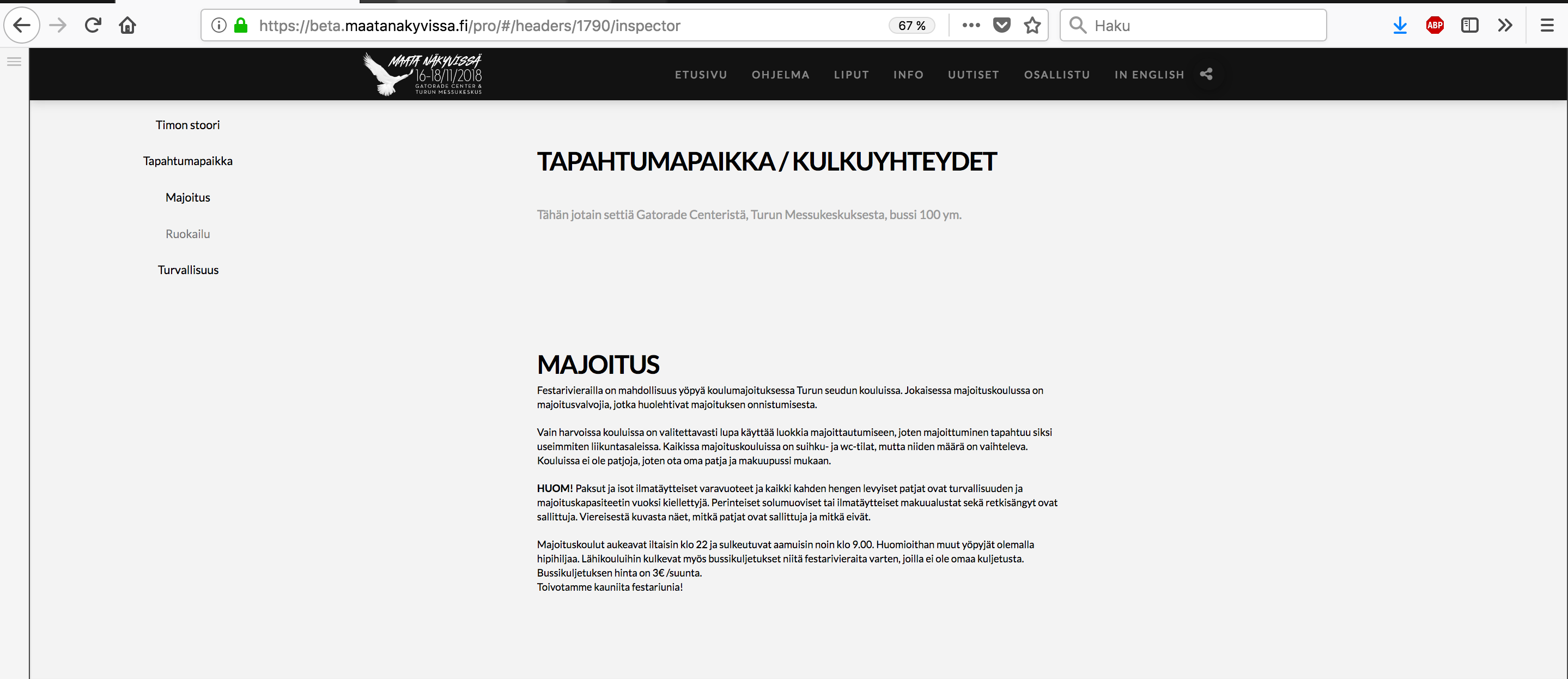
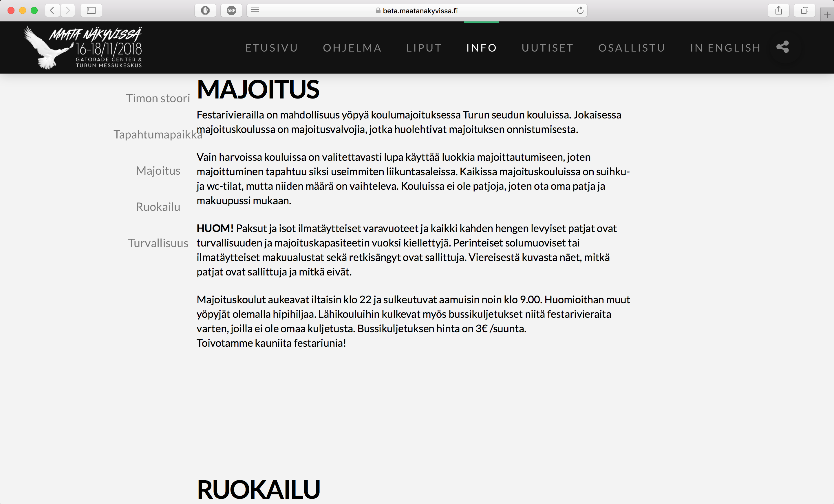
I would like to have the left menu to stick under the bird logo and now it drifts to the left and to the right depending on what’s your resolution. Does this help you to understand my problem? Images below.


Hi There,

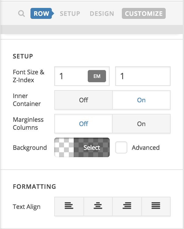
In this case, you should turn on the Inner Container option of row in that section:

I’ve just tested on various screen size and see that the menu always stays at the bottom of logo: http://quirktools.com/screenfly/#u=https%3A//beta.maatanakyvissa.fi/info/&w=2920&h=1080

Regards!

This topic was automatically closed 10 days after the last reply. New replies are no longer allowed.