Hi there
I’m having this problems with a sticky bar menu:
- The client needs 2 bars, one with logo and CTA and the other with a navigation dropdown menu
- I’ve already put the 2 bars ni place, but when I tried to configure the dropdown menu it just can’t show it, I’ve already tried the different options in the settings, but the dropdown is not showing, I’ve had to change it to navigation collapsed because the dropdown doesn’t work.
- I’ve put this settings on the bars:
- Bar 1 (menu-mobile)
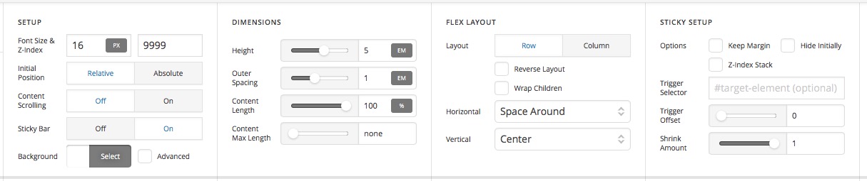
-Bar 2 (menu-mobile2)

Also in the custom CSS I’ve put this code:
#menu-mobile {
    position:fixed !important;
    top:0 !important;
}

#menu-mobile2 {
    position:fixed !important;
    top:5em !important;
}
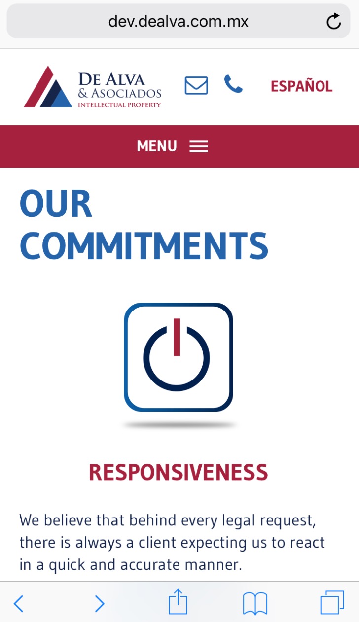
And the result on mobile is this:
- On page load (first time)
- On scrolling

- When you go back to top of the page
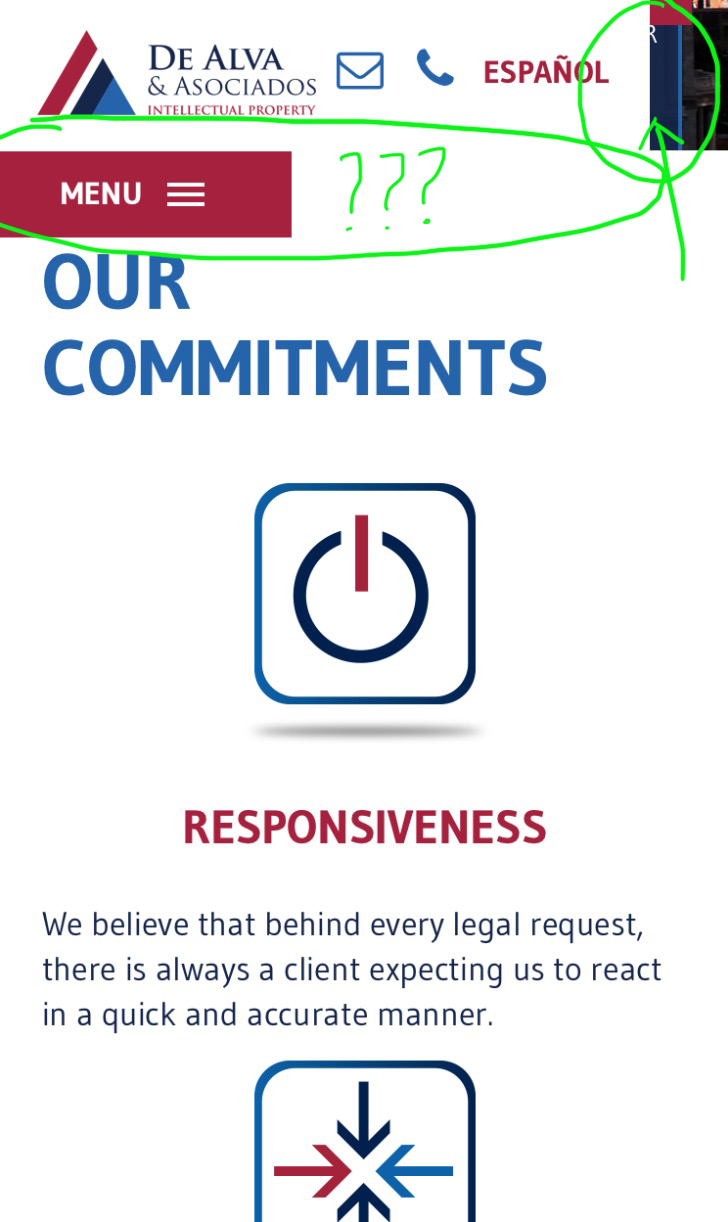
When you scroll down the menu moves to the left and resizes the bars, like if there’s a glitch or a visual error, is there something I can do to fix this?
Thank you!


