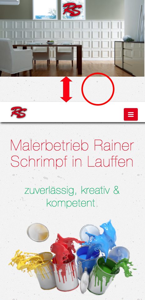
Space between slider and navbar

Hello Themeco-Team,

I wonder why my slider is not responsive. In full screen it works, but when I make the window smaller it creates a gap between slider and menubar. To create the slider I used the plugin “Slider Revolution”. This plugin is very good but very complicated for a beginner as there are many options for changeing.

I hope you can help me out :slight_smile:

Hi There,

I couldn’t replicate the issue you have mentioned above in any browser or mobile device.

Can you please confirm the device or OS you are having the issue.

Thanks

Hi There,

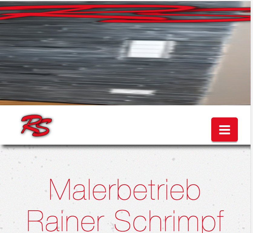
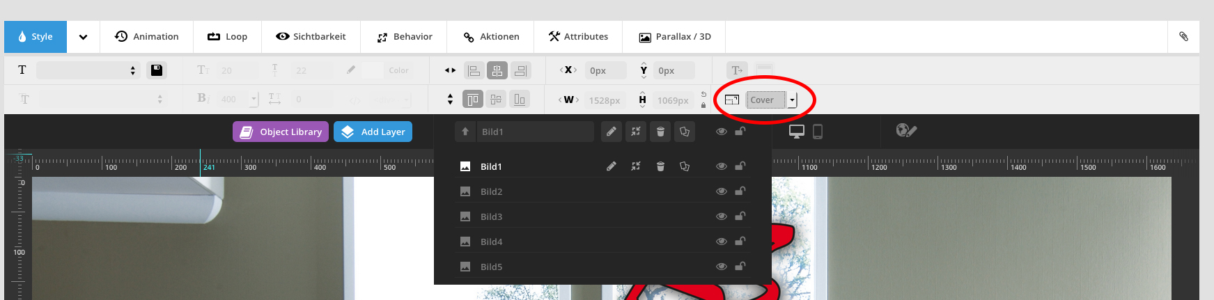
I already solved the problem by myself. I set the IMG Styling Option from Custom to Cover. It’s worked out.

greetings

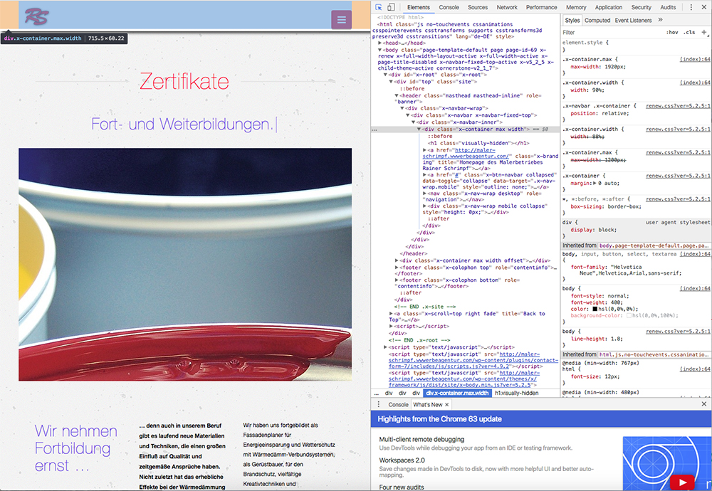
But now there was a new problem. My mobile menu button don´t work. He does not activate. It seems like an invisible object is in front of it. But i am not sure.

Is there a problem with my CSS:

/*Responive Design*/


@media (max-width: 1500px) {
    .x-navbar-inner h1.visually-hidden {
        font-size: 0em;

Do you find a solution for this?

Hi There,

Please change your custom CSS to this:

@media (max-width: 1500px){
    .x-navbar-inner h1.visually-hidden {
        font-size: 0em;
        display: none !important;
    }
}

Let us know how it goes!

1 Like

Perfect, exactly as I wanted. Thank a lot for the support

Vielen lieben Dank! :slight_smile:

You’re most welcome. :slight_smile:

This topic was automatically closed 10 days after the last reply. New replies are no longer allowed.