Hi
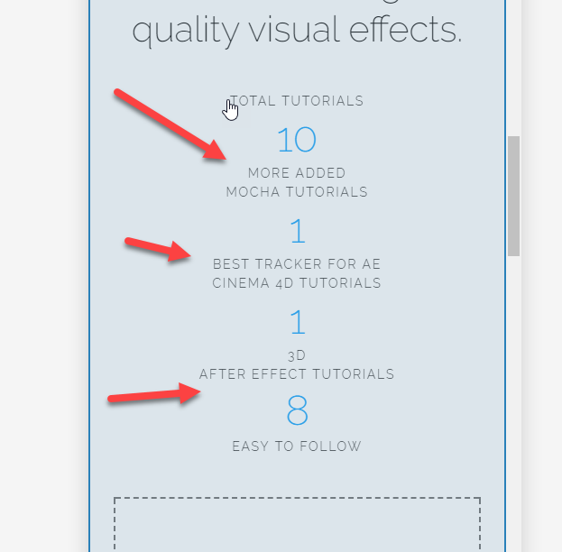
On my front page i have 4 counters in a row.
When viewing on the mobile as you see on the screenshot there is no space between them, i would like that
Hi
On my front page i have 4 counters in a row.
When viewing on the mobile as you see on the screenshot there is no space between them, i would like that
Hi @hrohibil!
There is an Gap element in Cornerstone. It can be displayed based on Screen widths.
Switch to the mobile view, and place the Gap element in between the first and the second counter. You can adjust how high you want it.
Then under Gap element’s settings, find “Hide Based on Screen Width”, and click the first three widest ones, and leave SM and XS. (Or test and see how counters behave at different screen widths).
Next, duplicate this Gap and place it in between the other three counters.
Now switch back to Desktop view, and gaps should be gone. That means you can now save changes and preview on your phone.
Hope this helps. 
PS, a more proper and advanced way would be doing it with Media queries, but Gap elements also work like a charm.
Thanks for chiming in, @Misho. That is right.
@hrohibil, for a demo, you might want to check this https://www.youtube.com/watch?v=Xt2FNAt_8DA. If you want the media queries route but don’t know CSS, we do have an in-house custom development team that offer paid services, who may be able to assist. They can be contacted at [email protected] if this is of interest to you. If you have any further questions about the theme, we are more than happy to provide you with assistance on these inquiries.
Thanks.
Thank you Misho
That did exactly what i wanted.
Thank you for your suggestion christianynion, but using Cornerstone without having any CSS knowlegde is exactly why i bought this theme. It is so easy to navigate, yet complex enough to cover your needs…
Glad to know the gap elements helped.
Have a nice day!