Small device view not accurate

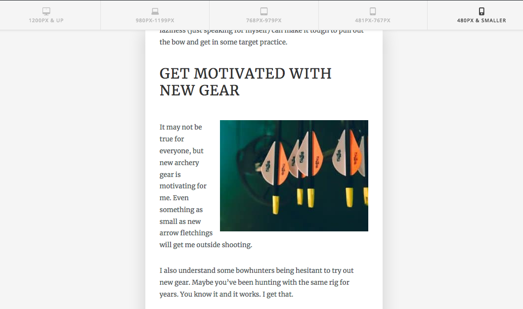
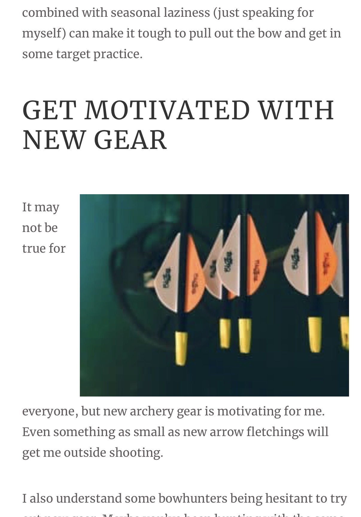
My sight looks good on while I am in cornerstone on the mobile device view. (see 1st image) The way it actually looks on phones is the second image. It primarily messes up the wrap text with pictures and is like this on other pages. How can I fix this? Any help is appreciated.
Hello Kasey,

Thanks for asking. :slight_smile:

Please add following CSS under X > Theme Options > CSS:

@media only screen and (max-width: 600px) {
  .wp-block-image {
    width: 75%;
    float: right;
    }
}

Here are some related links for further reading:

Hope this helps.

Thanks @Prasant! Worked great. Awesome!

You’re most welcome!

This topic was automatically closed 10 days after the last reply. New replies are no longer allowed.