Hi Support,
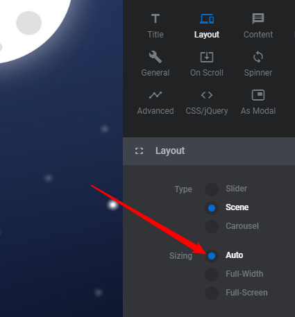
I have 2 sliders on the home page of a client site using revolution slider. The background image on the one slider needs to always be visible but no matter what setting i have used it keeps cropping the background image on laptop displays. currently set to full width layout.
The other slider is just a narrow motivational slider with words above the nav bar. It shouldnt have any padding around the words but keeps adding padding on larger displays. Please advise how to remove the whitespace around the wording on all screen sizes?