Hi X Team - My site is completed and looks great on desktop and laptop screens, but is not responding very well to mobile screens. It looks like the desktop version of it is showing on my iPhone. Can you please take a look and tell me what you see? More information to come…
Hello @bluetroop2,
Thanks for writing to us.
I checked your site on iPhone It seems that it is rendering the desktop version on the mobile. I attached the screenshot in the secure note. Please have a look at it.
Thanks
Well, yes, that’s correct, that’s why I’m contacting you for help. How do I get the phone and other mobile devices to display the mobile version? Can you assist?
Hi @bluetroop2,
I have checked your website and found that most of the pages are using the NO Container| Header, Footer template, whereas the Row in the page content is using the Global Container width which is the reason behind your issue. While using any of the No Container templates, please choose the Global Container Off for the Rows.
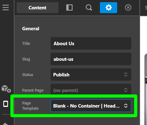

I went ahead and set the Global Container value to Off for the About Us page, which fixes the issue related to the responsiveness of the content area. I would suggest you replicate the same process for all the pages.
I have also found that the Header and Footer section is not also responsive and the reason behind the issue is the value set into the width is 1080% which might be px in place of %. I went ahead and reset the value to 100% in Theme Options > Layout And Design > Site Width.


Hope it helps you to resolve the issue. Please let us know if you find any difficulties in doing the above process.
Thanks
No, the global container setting in rows was not the problem, I do not want to turn it off because I do not want the content to go left to right full browser screen, on a desktop I want the site to have margins.
The issues was the site width, thank you for discovering and point that out to me.
This topic was automatically closed 10 days after the last reply. New replies are no longer allowed.