Sidebar with body wrapped under it

http://websozo.com/markanthonydev

I’m would like to have a sidebar like the one in grey displayed in the image. It has the body content show underneath, and is positioned like you see in the picture. I’d also like to get the black border lines as well. Thank you.

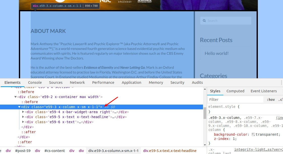
Hello There,

Thanks for writing in! Since you have used Cornerstone in creating that post, please follow this steps:

  • Insert a widget area element above the text element containing the body content.
  • Click the widget area and find the “Customize” tab.
  • Insert a custom right class
  • and add an inline css
$el {
  width: 250px;
  border: solid 2px black;
  padding: 20px;
}

@media(min-width: 768px){
  $el {
    margin-left: 20px;
  }
}

And you should be able to achieve what you have in mind. Please let us know how it goes.

That’s a great help! It’s getting there. However, on mobile it’s still taking up the body space. Can it show at the bottom for mobile?

Hi @nlwebdesign

In order to show this sidebar at the bottom on mobile devices, you need to add a custom class to this specific column:

Let’s say custom_column, then you need to add this custom CSS code to (Theme Options > CSS):

@media screen and (max-width: 680px){
    .custom_column {
        display: flex;
        flex-direction:  column;
    }
    .custom_column .right {
        order: 3;
        margin-top: 30px;
    }
}

This should do the trick!
Thanks.

I was able to customize this and get it to work. Thank you.

Last question for this thread: My top picture in the body text is not responding to mobile well. It’s leaving the background of the caption box there and bumping the picture down below the widget. Also, I’d like to remove the caption box side and top border as seen here: https://drive.google.com/file/d/1MrjmK69c7Re6KEHz9Cq9QOpbN2-Obbjs/view?usp=sharing

Thank you

Hello There,

Please update the css code and use this:

@media screen and (max-width: 979px){
    .custom_column {
        display: flex;
        flex-direction:  column;
    }
    .custom_column .right {
        order: 3;
        margin-top: 30px;
    }
}

This should make sure that the sidebar will be at the bottom when viewed in smaller screens.

Please let us know how it goes.

This topic was automatically closed 10 days after the last reply. New replies are no longer allowed.