Sidebar Shrinkage

Hi.

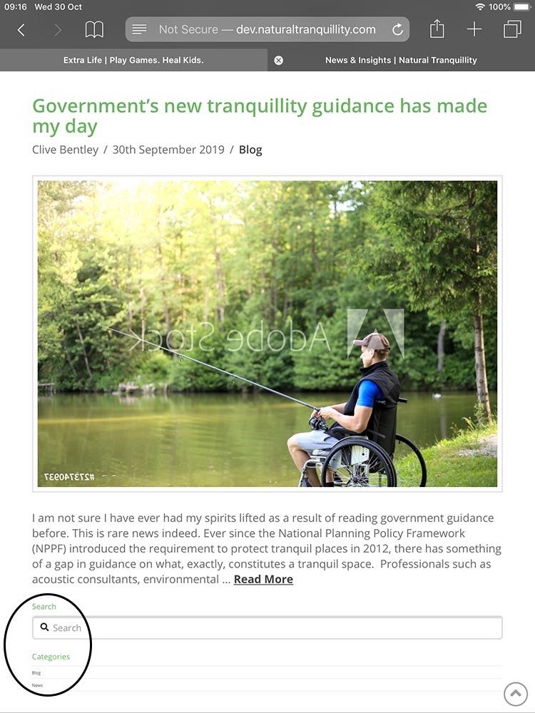
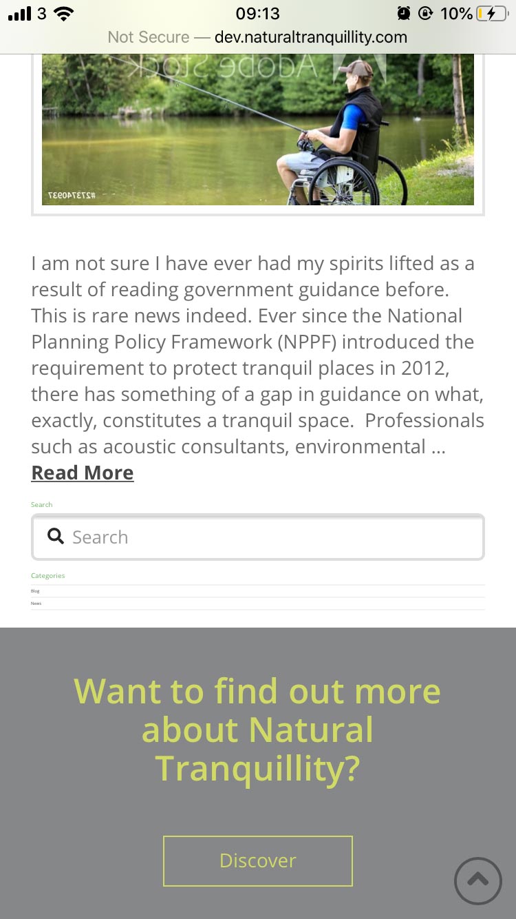
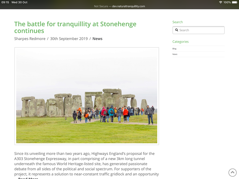
Is there any reason the sidebar automatically shrinks? Is there a way to rectify this without having to style each viewport, as there haven’t been any styling changes for it to shrink drastically in the first place.

Please see the screenshots, thanks.

Hello Chris,

Thanks for writing in!

The resolutions on which website is being tested (as per screenshot) is a mobile and tablet viewport. As per the web standards on mobile or tablet viewports main content area gets the preference on the canvas area. That means sidebar will showup after the content area. Next is the available real estate area. On mobile, screen width is limited in comparison to tablet and desktop screens. So, to maintain the proportion and the sidebar layout needs to be adjusted accordingly.

Although not recommended as usually it creates layout issues going further. Having said that if you would like to proceed, for this you will have to restyle the sidebar and main content area according to each viewport manually. You can use CSS media queries to make the necessary changes. Here’s the resources that you can refer:

https://www.w3schools.com/css/css_rwd_mediaqueries.asp

Thanks.

Hello, we understand we can fix this using css and media queries but shouldn’t this work out of the box? We’ve not made any edits to the sidebar, for it to shrink to the extent it has.

Thanks.

Hi Chris,

Sorry, but I’m kind of confused what do you mean by “shrinks”, if you mean the stacking of content and sidebar on mobile views then that is the responsive behavior of the Theme. If you want to keep the content and sidebar inline and squeeze in mobile devices (767px and below), then you need to apply a custom CSS media query.

Thanks,

Hi,

The stacking is fine, we have no problems with that. If you look at these screenshots that are from actual devices, you will see the actual headings and text Shrink dramatically in comparison to the body. As the screen size gets smaller the font size gets smaller, however its to a drastic extent.

As far as we are aware, we haven’t added any css to change this, so before manually changing it, we’d like to know if there is something in the theme we can change first or have rectified…

Thanks.

edit: This is an example link http://dev.naturaltranquillity.com/news/

Hello Chris,

After further investigation, it turns out that the issue occurred because you added this custom css in your child theme’s style.css file:

body {
    background-color: #d6d6d6;
    font-family: 'Helvetica Neue';
    font-size: 0.83vw;
}

Please remove font-size: 0.83vw; or at least use em, rem, % or px units.

1 Like

Thank you ever so much for the help, didn’t realise that was there, we have a few people working on the site at the same time, so you know what thye say, “too many cooks”.

Apologies on not looking closer, thank you!

Glad it’s working now and you’re most welcome!

This topic was automatically closed 10 days after the last reply. New replies are no longer allowed.